
Pictured: Detail of Endsheets from Tonoharu: Part One
This is the sixth post in a series describing the creative process behind my graphic novel Tonoharu. This installment, along with the two that preceded it, deals with the design considerations. Those who haven’t already are invited to read parts one and two of the design series before diving into this one.
*****
Shading and Color:
For reasons described in the previous installment of Creating Tonoharu, I decided to omit the black borders that typically run along the edges of panels and word balloons. Without these iconic lines, it became necessary to define these areas in a different way.
I decided to do this through the use of a second color in addition to black. This second color would flood most of the panel, thereby defining the edges of the panels and word balloons. For the most part I think this approach worked out pretty well, but I did have to make a few revisions to it as I went along.
For the first few drafts, I made fairly extensive use of white (i.e., the color of the paper). In addition to using it for the word balloons and characters, I also used white to define the objects as part of the foreground, add glare to windows, and provide contrast in the backgrounds.
What I soon discovered, however, is that while this looked good, its accumulative effect didn’t read well. The heavy use of white divided attention between the things that mattered (the main characters and the word balloons) and the things that didn’t (window reflections and tabletops). In an effort to focus attention back where it belonged, I restricted the use of white to only the main characters and the word balloons.
This change definitely improved readability, but after removing all the white from the backgrounds, the lack of contrast made them a little too monotonous. To address this, I blatantly ripped off Canadian cartoonist Seth’s masterful use of two colors in his comic Clyde Fans (PDF example), by using a 20% tint of black to serve as a pseudo third color; gray. By adding gray on top of the darker areas of the background, it subtly created contrast without compromising readability.
Below is a “before and after” shot from Tonoharu: Part One, showing the aforementioned alterations to a typical page:
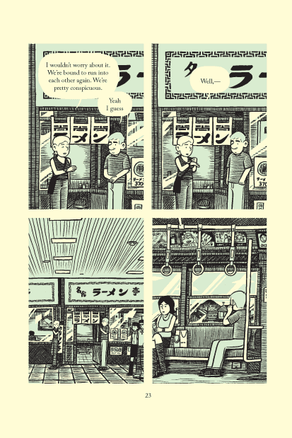
Before, with heavy use of white
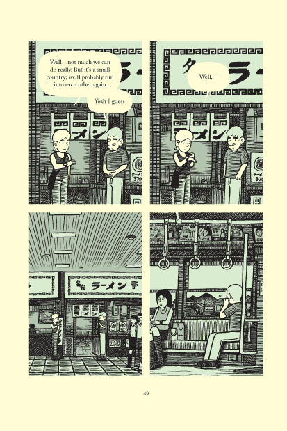
After, with less white, plus a grey accent color
Typography:
Despite the fact that improved computer technology has made the mechanical lettering of a comic pretty easy, virtually all of the cartoonists whose work I admire still letter their comics by hand. Part of the reason is probably habit, but there are definitely aesthetic advantages to this approach. The sensibility of the artwork carries over into the lettering, making for a more cohesive whole. Hand lettering allows the artist to add calligraphic touches to the text. And there’s a warmth to hand lettered comics that just isn’t present in comics lettered by computer.
Despite these advantages, I opted for the mechanical approach to lettering Tonoharu for a number of reasons. As mentioned in the first entry of this design series, I wanted to emulate a nineteenth century design sensibility, and thought that a typeset comic would better serve that. Lettering on a computer also made editing the text much easier. If I had had to break out the whiteout every time I wanted to experiment with some small editorial change, I probably wouldn’t have edited nearly as much, and I think this cumulative effect of all those little edits greatly improved Tonoharu. And finally, readability was a primary consideration for all my design decisions, and I felt that a typeface would better serve that than my hopeless scrawl.
One pet peeve of mine is when a typeset comic uses a typeface that’s designed to look hand-written. It always reminds me of those sneaky pieces of junk mail that try to trick you into thinking they were hand-addressed to entice you into opening them. My comic was lettered mechanically, and I didn’t want to try to hide that fact.
As such, I tried to emulate the typography found in prose books instead of the calligraphic nature of traditional comic book word balloons. I was very concerned with the balance of each word balloon, and tried to treat each one as though I were typesetting a stanza of poetry. I avoided messing with italics, boldface, and different font sizes. To me, this sort of thing gets used too often in comics. I’d rather let the reader add their own emphasis instead of spoon feeding it to them.
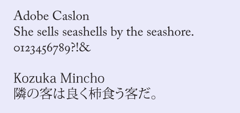
I took great care deciding what font to use for Tonoharu. As a part of my effort to create a “19th Century” look, I choose the conservative serif font Adobe Caslon for English language text, and Kozuka Mincho for the Japanese.
One final note about typography: on the front cover of Tonoharu: Part One and in a few other places, I use an ‘o’ with a line over it (ō) for the first ‘o’ in ‘Tonoharu’. This is called a macron, and is used to designate a long vowel sound. It’s largely fallen from use, but I like these little bits of typographic ephemera, so decided to put it in.
******
There are a few other things I wanted to write about that fall under the canopy of “design”, but this entry is already literally twice as long as I try to keep them down to, and I figure three entries on the subject of design is (more than) enough. Some of my unused thoughts on design will probably be incorporated into the next installment of Creating Tonoharu, which will finally get to brass tacks and address my process for actually drawing the damn thing. That will be up sometime in January; the last two entries of this year will be devoted to something else.
One final note: I addressed some of the design decisions I made for the front cover of Tonoharu: Part One in this entry, so if you aren’t sick of all this design nonsense by now, check that out.
Creating Tonoharu–#1: Laying The Groundwork
Creating Tonoharu–#2: The Idea
Creating Tonoharu #3–Writing the Script
Creating Tonoharu #4–The Design (1/3)
Creating Tonoharu #5–The Design (2/3)
Creating Tonoharu #6–The Design (3/3)
Creating Tonoharu #7–The Drawing
Creating Tonoharu #8–Inking
Creating Tonoharu #9–Computer Stuff
Creating Tonoharu #10–Final Edits