
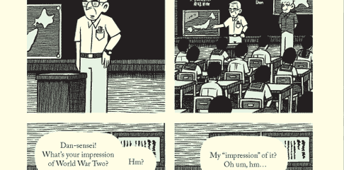
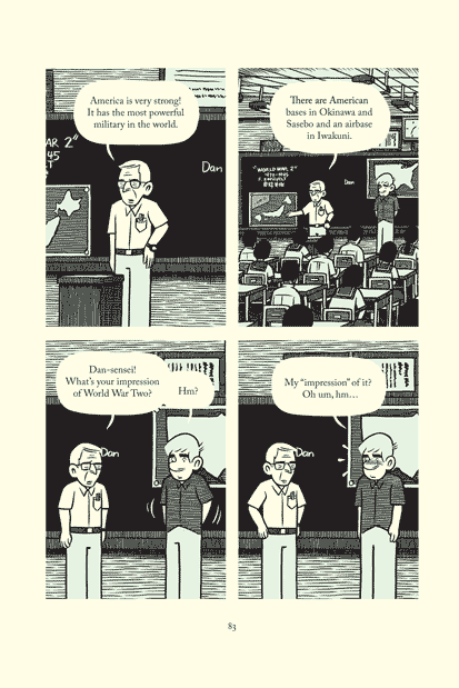
Pictured: A chunk of Tonoharu: Part One, page 83
This is the fifth post in a series describing the creative process behind my graphic novel Tonoharu. This installment, along with the one that proceeded it and the one that will follow it, deals with the design considerations. Those who haven’t already are invited to read the previous entry before diving into this one.
*****
Page Layout:
Many comic books feature elaborate page layouts with panels of all different sizes, weird “camera” angles, characters that jump out of the borders of the panels, and panels that bleed off the page. Pages laid out in this manner are more interesting to look at than conservative layouts, but are also more difficult to read.
Go to a bookstore and take a look inside a few of the prose books. Despite the fact that the cover designs run the gamut of aesthetics, the interior pages are all pretty much the same from book to book. Page after page of a conservative typeface printed in black, on top of white paper.
You spend hours looking at the inside of a book, and if that funky, eye-catching cover design carried over into the pages of the book, with different colors and words of all sizes, it would become grating pretty quickly. Readability isn’t sexy, but it’s important.
Maximizing readability was my primary consideration in creating the page layout of Tonoharu. I wanted the layout to fade into the background, and let the content take center stage. Since consistency is a critical component of readability, so I decided to base my panel layout on a grid, with each panel on every page being the same size and shape.
Choosing the number of panels per page was a balancing act between wanting to give each panel enough room to tell the story, and having enough panels per page so that a potential consumer would feel like they were getting enough “bang for their buck”. I had already decided I wanted to keep the page size small, so I ultimately settled on a four panel grid. Six or eight panels per page would have been better from the “bang for your buck” perspective, but I felt that cramming in more panels just wouldn’t give me enough space to show the Japanese landscape in the way I had envisioned.
In another nod to readability, I decided to forego putting borders around the panels and word balloons. I’ve always thought that those big black borders subtly draw attention away from where it should be: on the pictures and words. Doing away with them meant introducing a few more design challenges, which I’ll write about next time.
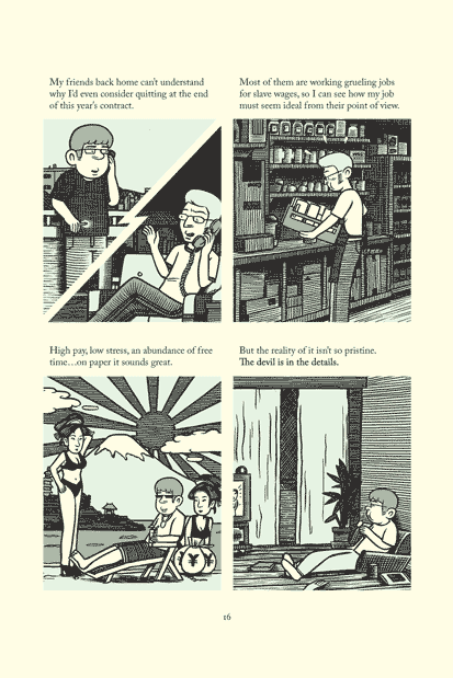
Below are a couple of typical pages from Tonoharu: Part One. Click on each image to see an enlarged view:
*****
One way or another, I’m going to wrap up my discussion of design in the next installment of Creating Tonoharu. Topics covered will be color & shading and typography. That will come on Friday, December 14th. For next Friday’s entry, I want to write about something completely different, so if you’re sick of all this design nonsense, check that out.
Creating Tonoharu–#1: Laying The Groundwork
Creating Tonoharu–#2: The Idea
Creating Tonoharu #3–Writing the Script
Creating Tonoharu #4–The Design (1/3)
Creating Tonoharu #5–The Design (2/3)
Creating Tonoharu #6–The Design (3/3)
Creating Tonoharu #7–The Drawing
Creating Tonoharu #8–Inking
Creating Tonoharu #9–Computer Stuff
Creating Tonoharu #10–Final Edits