
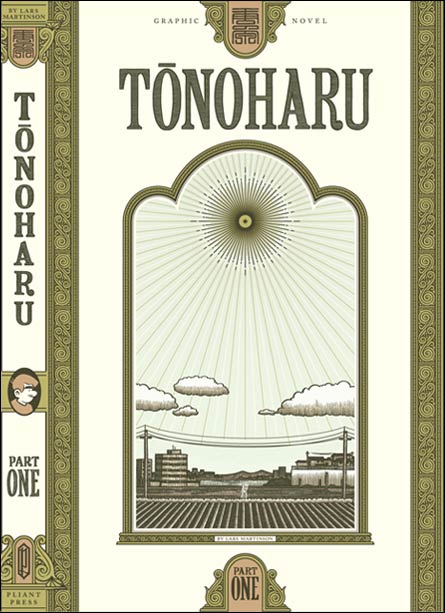
After going through a dozen of different concepts and then spending weeks refining the one I ultimately chose, I’m finally done with the dust jacket for Tonoharu: Part One.
The colors will probably change a bit (for example, the mustard color will probably be printed in a matte finish metallic ink), and I have to talk to a printer to find out exactly how thick the book will be before I can completely finalize the spine width. And of course I’ll be making nit-picky little changes right up until I go to press. But it’s basically done, and for the most part I’m happy with it.
Tonoharu is a four-part story, with each part being about 100-150 pages. My original plan was to finish the whole thing and then publish it as one volume, but it’s just taking too damn long to draw, so I’ve decided to serialize it as a tetralogy and publish them as I finish them.
Naturally all four covers need to have their own distinctive look, but at the same time I want each one to share certain traits so it’s obvious at first glance that they are all part of the same series. So in creating the dust jacket, I had to develop a basic design template what would work well not just for the first part, but that could be easily adapted to the needs of the three covers that will follow it.
What I decided to do is to have each book feature the same basic design; the same the same masthead, the same tombstone-shaped frame on the front cover, the same decorative borders down the edges, etc. To differentiate each book from the others, I decided to have the spines feature a different accent color and a different character in profile. For the front cover, each one will feature a long shot of a different location in the story at a different time of day. Part One is around noon, part two will be sunset, part three midnight, and part four sunrise. (The locations are, at present, confidential. ;-) )
I think the biggest failing of the front cover is that since it features subtle colors and fine, detailed illustrations, it doesn’t translate as well when displayed on a computer screen as a high contrast, simple design would. My files are prepared for press at a resolution of 1200 dots-per-inch (or “dpi”). The average computer monitor displays around 72dpi. So when displaying this cover on a computer screen, a lot of that critical detail is lost (even more so when it’s displayed at smaller than actual size as it is here).
From a marketing standpoint this actually kind of a big deal. I’m hoping to eventually sell this through book stores, but that probably won’t happen from day one if I self-publish. Initially most of my sales will probably come via internet-based sources (amazon.com or my yet-created “pliantpress.com” website). That means that for most potential customers, their first (and perhaps only) encounter with the cover will be via a computer screen. Since the cover is sort of like a mini-promotional poster for the book, if it doesn’t look good when reproduced as a thumbnail on a 72dpi monitor, that could be a lost sale.
But oh well. I’ll just have to rely on OVERWHELMINGLY POSITIVE WORD-OF-MOUTH and my HUGE MARKETING MACHINE to make up for that design deficiency. :-/