
I’m currently out of the US, and for a couple of years have asked my father to send out orders for me. Due to concerns surrounding the coronavirus, I’m no longer going to ask him to trudge over to the post office for me for the time being. Hopefully we can open the store again later this year, but for now we’ll have to wait and see. Everyone stay safe and healthy!
Dr. Darley and the Prisoners at Santa’s Workshop
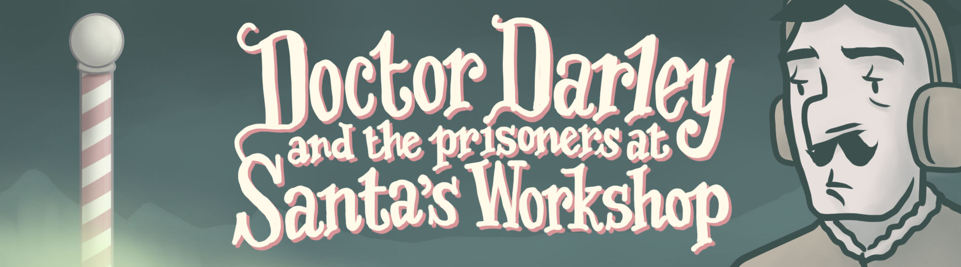
I just finished a new visual novel!
You can see more details about it, and download it for free here:
https://pliantpress.itch.io/darley02
Dr. Darley and the Case of the Deboned Children
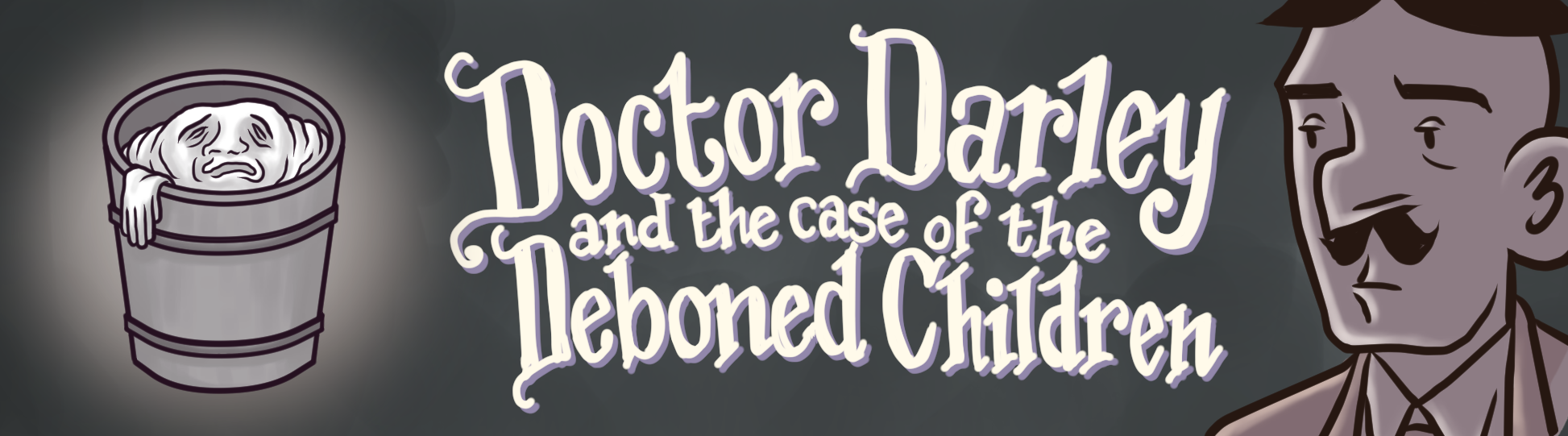
I recently finished a brief visual novel!
You can see more details about it, and download it for free here:
https://pliantpress.itch.io/darley01
Done is Better than Perfect
In 2003 I started work on an illustrated story that ultimately took me 13 years to finish. My most recent project, on the other hand, took me just one month.
To be fair, these two projects were pretty different. The 13-year one was a lengthy, three volume graphic novel, whereas the month-long one was a short visual novel [ YouTube link about visual novels ].
So I’ll admit I’m comparing apples to oranges. But on the other hand, in the time it took me to do the 13-year project, I could have hypothetically done more than 150 one-month projects. When I think of it in those terms, I consider it quite a staggering improvement in terms of productivity.
A number of factors contributed to me to completing it as quickly as I did, but what really sealed the deal was completely revamping my artistic approach on a fundamental level.
In the past, I had two goals in mind as I worked on projects:
1) Strive for the highest quality I could muster.
2) Finish it in a timely manner.
Needless to say, these two goals are at odds with each other. The longer you spend improving and refining, the less likely you are to meet a deadline. And in the past, I pretty much always allowed the first goal to trump the second.
And while we tend to idolize the uncompromising artiste, there’s a danger to that approach, especially if you’re a perfectionist. A danger that you might push the deadline back time and time again, and end up working on one thing for, cough, more than a decade. Whoops!
Which led me to the approach I adopted for the one month project:
1) Finish it within a certain time frame (a month in this case)
2) Make it as good as I could with the time that I had.
Obviously it’s pretty similar to my previous approach, but with one important change: the priorities are reversed. For this new approach, finishing it by the deadline is what mattered most. Even if that meant resorting to stick figures and letting plot holes slide. Finishing it on time meant success, finishing it late meant failure.
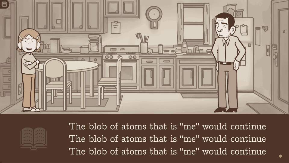
So instead of striving for the impossible ideal of perfection, my first priority was to first finish something, anything, that could technically be considered “done”. That involved dashing out a clunky script and slapping together placeholder images, with characters being represented by blobs of color. I had that bare-bones version done in about 10 days. It was complete in that you could read it from beginning to end, but it was pretty awful.
The remaining 20 days were devoted to racing against the clock to try improve it as much as I could. This was an iterative process. I was constantly reevaluating what the weakest component was, devoting just a bit of time to improving it, and then finding the new weakest link and trying to improve that. I started by improving the art, so that each character was represented by a rough sketch rather than a blob. Then I did the same for the backgrounds. Then I returned my attention to the script, and tried to tighten that up a bit. Then the overall user interface. And then I returned to the characters to polish them up a bit. And so on and so forth.
Often I had to make tough choices. The original script called for two more locations than the final story has. But with the clock ticking, I asked myself: do I really need these, if drawing them will eat up two precious development days? I ultimately decided no, and reworked the script to omit them. In one case, I think the story would have been a little better with the extra location in tact, but in the other case, I thought my reworked version actually worked better.
Pretty much every aspect of this thing could be improved if I gave it another couple weeks. Probably the biggest flaw is there is literally no sound or music at all, which, I’ll admit, is a pretty big omission for a visual novel.
Maybe I’ll revisit it someday and make some of those improvements, but for now, in the spirit in which it was created, I’m content calling it done. Instead I’d like to move on to another project, and try to finish it in a similar time frame. Maybe I’ll give myself a little more time so I can add music and tweak a few things, but I still want to shoot for around a month in any event.
My short term goal is to finish a few projects in roughly the same amount of time, but to improve each one bit by bit. Then if I reach a point where I think these are ready for prime time, I might devote more time to one of them.
But even if I return to more lengthy ambitious projects, I like the idea of getting a rough, readable version done early on. I think that’s a good exercise to help define the scope, especially if you’re like me and tend to let projects spiral out of control.
ANYWAY, I’m still sorting out how I’m going to distribute this visual novel, but will be releasing soon. So you’ll can judge for yourself whether or not I pulled it off. So stay tuned!
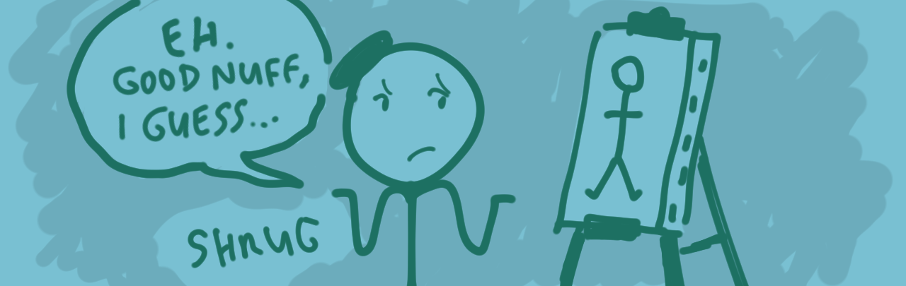
Visual Novel Design Doc
 Above: Preliminary art for my planned visual novel project. (Ignore the weird placeholder text.)
In a previous blog entry, I posted a video explaining what visual novels are and why I’d like to try making them. About a month after that, I posted a video of my first attempt at a visual novel, a Twilight Zone-esque short story entitled The Grandfather Paradox.
Making The Grandfather Paradox convinced me that I need to collaborate with a programmer from here on out, so I’ve gone ahead and made a document intended to explain to potential programmers what I want to do. You can view it here:
http://larsmartinson.com/vn-design-doc/
So… yeah. It’s pretty long, and probably not an interesting read. It’s basically intended to be a blueprint for how I want the visual novel to work on a technical level; nothing more, nothing less. But feel free to quickly scroll through and look at the screenshots, that could maybe be mildly interesting, I suppose.
Now that I have a design doc that explains what I want to do, the next step is trying to recruit a programmer. I feel a bit out of my depth; I’ve never really collaborated on an artistic project, having created Tonoharu pretty much all by myself. If any programmers (or people who have collaborated with programmers) have any advice, please let me know!
Related: Here’s a post I made on a Ren’Py forum: (“Ren’Py” being a popular program people use for visual novel development):
https://lemmasoft.renai.us/forums/viewtopic.php?f=8&t=42728
https://lemmasoft.renai.us/forums/viewtopic.php?f=8&t=42728
It includes a bit more information if anyone’s interested (though again, it’s still pretty dry reading).
The Grandfather Paradox
(The “video description” referenced at the beginning of the above video can be read here: [ Direct YouTube Link ] or at the bottom of this entry)
Last month I linked to a YouTube video I made that discussed visual novels and why I’m going to try my hand at them.
That video included a link to the above video, but I figured I should should give this video a spotlight, since I’d like to get feedback from people. So as the video says, watch some (or all) of it and let me know what you think. Thanks!
***************************************************
[Original You Tube Video description]:
John receives an urgent text from a friend in the middle of the night begging him to meet at a designated hotel room. When John arrives he’s met not by his friend, but a heavily disfigured stranger.
So begins “The Grandfather Paradox”, a visual short story evocative of “The Twilight Zone” and “Black Mirror”.
Your feedback is welcome! Please let me know what you think of this, either in the comment section or twitter:
https://twitter.com/larsmartinson
And if you know anyone who might be interested in this, please share it with them. Thanks!
*****
Other videos by me:
What Visual Novels & Indie Comics Can Learn From Each Other: https://youtu.be/37HjhnnaGns
4 Time-Saving Tips (from a guy who spent 13 YEARS drawing a comic): https://youtu.be/6BzCDVR-tr8
******
–Technical Details–
“The Grandfather Paradox” was created using game development software (Unity ver. 5.1.2 and Fungus plugin ver. 2.2). As the introduction says, I intended to release it as a download, which would have allowed the reader to click through the text at their preferred pace.
But the downloadable version had three major problems that made me decide it wasn’t worth releasing in its present state:
1) There’s no way to save or bookmark progress, meaning if you close the program, you have to start reading from the beginning.
2) There’s no way to go back if you click through a line of dialogue too fast.
3) The file size was huge (like 400mb). Efforts to lower the file size resulted in really blurry graphics.
I’m not a programmer, so there’s nothing I can do to fix these issues, so I decided to release this exclusively as a video (at least for now).
But if you’re familiar with Unity and think you could help me sort out these issues, please get in touch!
Related: I’m going to do at least one more of these “Indie comic/visual novel hybrid” things, and doing this one has convinced me a need to collaborate with a programmer.
I was thinking of doing the next one in Ren’Py, a Python-based visual novel engine. Or maybe I’ll take another swing at Unity again. Anyway, if you have experience with either of those engines and would be interested in collaborating, please get in touch. Thanks!