

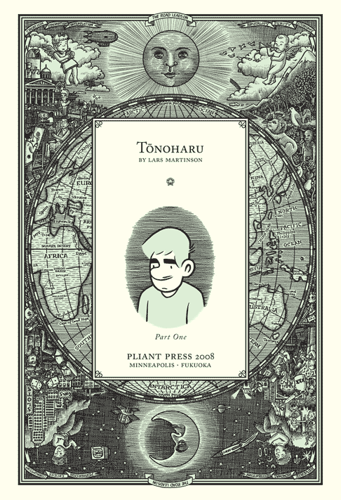
Pictured: Detail from the title page of Tonoharu: Part One
This is the forth post in a series describing the creative process behind my graphic novel Tonoharu. This installment (along with the next two) deals with the design considerations.
*****
These posts are organized so that each one addresses a different stage of my creative process, in chronological order. In practice, the stages bleed into each other so it’s not always clear where one ends and another begins, but basically my process boils down to: 1) Inspiration, 2) Writing/Editing, 3) Drawing, and 4) Editing again.
There is, however, one important element that doesn’t neatly fit into the above chronology. It began when I first started working on Tonoharu, and came to a close when I finalized production details earlier this week. That is the overall design.
I figured that this point in the Creating Tonoharu series is as good a time as any to address this unruly topic, so following are some of the design decisions I made for Tonoharu and why.
*****
The Overall Look and Feel:
My guiding design principle for Tonoharu was this: if “graphic novels” had existed in the nineteenth century, how might they have looked?
Now, I don’t mean that in the most literal, nitpicky sense. I certainly don’t have the know-how to really simulate a nineteenth century book, and I’m willing to “bend the rules” anyway. My story takes place in the present day, I’ve taken advantage of printing technology that didn’t exist a hundred years ago, I’ve (begrudgingly) put a barcode on it, etc., etc….
That said, old books just felt like a good starting point to base the rest of my design decisions on. There’s an elegant simplicity to the design of older books, and the illustrations, when present, are always gorgeous.
Below are a couple examples of my inept attempts at this sort of design. Shown here are the title page and a wingding used on the last page (based heavily on one I found in a book published in the 1890s). Click on each image to enlarge it.

*****
Page size:
The size of a standard American comic book (about 6.5″ x 10″) works just fine for 24 or 32 pages. But when these comics are collected into a couple hundred page book, it’s just a little too big. Holding them puts a strain on your hands, so you have to rest the book on your stomach or lap, which makes turning the pages a pain.
Okay, I’ll admit it’s not a huge deal. But I figure the format of a book shouldn’t be a concern to the reader at all; I’d rather that they concentrated on the story. So I wanted to go with something small enough to be comfortable to hold. But at the same time, I wanted the page to be large enough to properly display the artwork. I ultimately decided that the digest format often used for prose books (5.5″x8.25″ or thereabouts) provided the right compromise between these two factors.
*****
I had originally intended to devote just one entry to the subject of Tonoharu‘s design, but due to my insufferable long-windedness, it looks like I’m going to need to spread it out over three installments. The design topics covered next time are sure to be just as fascinating as “page size”! So check back next Friday for that.
P.S.–Although I said that “graphic novels” didn’t exist in the nineteenth century, one could actually make a case that they did. But anyway…
Creating Tonoharu–#1: Laying The Groundwork
Creating Tonoharu–#2: The Idea
Creating Tonoharu #3–Writing the Script
Creating Tonoharu #4–The Design (1/3)
Creating Tonoharu #5–The Design (2/3)
Creating Tonoharu #6–The Design (3/3)
Creating Tonoharu #7–The Drawing
Creating Tonoharu #8–Inking
Creating Tonoharu #9–Computer Stuff
Creating Tonoharu #10–Final Edits