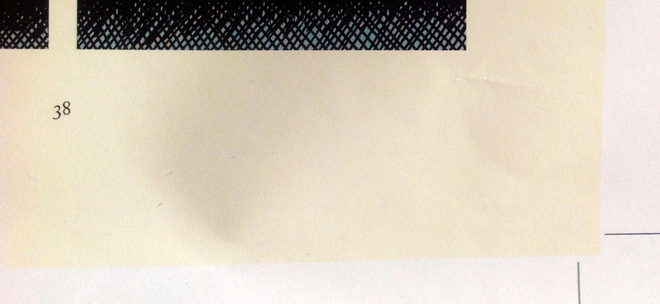
 Pictured: Tonoharu: Part One Proof Detail
Until the latter half of the twentieth century, most books were printed on a letterpress. Rows of raised metal letters were arranged on a block, inked, and then pressed into the paper. The pressure required to transfer the ink created an indentations on the printed page. Master printers strived to have the letterpress “kiss the paper”; to use only as much pressure as was strictly necessary to transfer the ink, leaving the paper as smooth and indentation-free as possible.
These days, laypeople reproduce documents on photocopies and laser printers, and most books are printed using offset lithography. These technologies leave no indentations on the page at all, and are considerably cheaper, easier, and more versatile than a letterpress.
So when letterpress printing is employed now, it’s for aesthetic rather than practical reasons. The designer wishes to evoke a traditional/classic feel that letterpress printing imbues. And the main characteristic that distinguishes letterpress printing from modern methods is the indentations.
So rather than try to eliminate them, modern letterpress printers try to make the indentations as obvious as possible. They use durable, thick paper stocks, and apply as much pressure as they can to really dig those letters in. What was once a defect has become a feature.
These thoughts occurred to me as I was preparing files for the forthcoming Tonoharu: Part One paperback. The hardcover editions Tonoharu were printed on cream-colored paper stock, but I’ve since learned there’s a more cost effective way to get a similar effect. It’s actually cheaper to print on the interior pages on standard white paper, and then coat the page with cream-colored ink to simulate cream paper stock.
At first blush this seems completely counterintuitive. Can you imagine trying to save money by doing this on an ink jet printer? But commercial printers play by a different set of rules. And if makes sense when you think about it. Mixing inks is a lot easier and cheaper than making colored paper from scratch, so rather than having small qualities of a million different colored papers, they can just buy white paper in bulk and custom mix ink to whatever hue their customers want.
The simulated cream paper is cheaper than actual cream paper, but it’s not free of course. Giving the pages of Tonoharu the cream treatment added about 10% to my production costs.
So basically, I’m paying a premium to make the pages of Tonoharu look like they’ve been yellowed with age; to give them a more “natural” feel than the artificial, bleached white paper. It’s kind of ironic, right? I’m taking great pains to obscure the actual paper stock in order to foster the appearance of authenticity. I thought that was kind of funny.


 Pictured: The key to happiness (apparently).