Come See My Work, Tokushimites!

Starting today (Tuesday, February 23), some of my work will be on display here in Tokushima, Japan. It’s a very small, informal group show for Shikoku University’s Calligraphy Department research students (all three of us).

My contributions amount to two pieces of mediocre calligraphy, and about ninety pieces of original art from Tonoharu: Part Two. Here are the deets:

Dates: Tuesday, February 23, 2010—-Friday, February 26, 2010
Time: 9am to 5pm
Location: The second floor of Shikoku University Kouryuu Plaza, Tokushima, Japan

See you all there!

What’s that you say? You live on the wrong side of the planet and I haven’t given you enough notice to book a ticket to Japan? In that case, here’s a few images of what you’re “missing”… Continue reading Come See My Work, Tokushimites!

The Bearers of Meaning


Whenever we meet someone from, say, Thailand, we do our best to simulate the native pronunciation of their name. The Thai way of saying it is considered to be “correct”, and when our English-speaking tongues are unable to faithfully recreate the sounds, we sheepishly apologize for our substandard approximation.

I was surprised to learn recently that this idea, that people’s names have an absolute “correct” pronunciation, isn’t universal. I was talking to a Japanese grad student named Ms. Kawai, who had recently returned from a year abroad in China. During the course of our conversation, she mentioned that her Chinese friends and colleagues called her Chuan-He. When I asked why, she told me that Chuan-He is the way the characters that make up her name are pronounced in Chinese.

Apparently, “translating” Japanese names into the Chinese pronunciation is not at all uncommon. This speaks to underlying differences between English and Chinese.

The English written language is tied to sounds. The letter “M” doesn’t mean anything, it simply represents an “mmm” sound. Only by stringing letters together do we get words that have meaning.

The Chinese written language, on the other hand, is tied to meaning. Each Chinese character intrinsically represents a concept.

Pronunciation in Chinese can vary wildly depending on what dialect you’re speaking. Someone who grew up speaking Mandarin Chinese wouldn’t understand a word of Cantonese Chinese. In fact Mandarin and Cantonese are different enough that they would probably be called different languages (rather than just dialects of the same language) if it weren’t for the common writing system. Pronunciation isn’t absolute in written Chinese, meaning is. So rather than struggle with the Japanese pronunciation of a Japanese name, they just say it the Chinese way.

Isn’t that interesting?

Koko the Clown in “The Cure”


Direct Link

Above is a Fleischer cartoon featuring Koko the Clown, the studio’s big star until Betty Boop (and the now largely forgotten Bimbo) came along.

One thing that really impresses me about the oldest Fleischer cartoons is how strong the line work is. In modern cartoons, lines are razor-thin and uniform in width, and don’t really have any personality. The lines found in the old Koko shorts, on the other hand, have an expressive, calligraphic presence. That this quality was achieved not in still illustrations but in the labor-intensive medium of animation is pretty remarkable I think. I can’t think of any modern animation that uses lines so artfully.

Tokuyoushashosakuten

Last weekend my work was displayed as a part of a gallery show at the Tokushima Museum of Literature & Calligraphy.


The logo for the show, written/designed by my advisor Hiromitsu Morikami

It was a small show, with seventeen people each displaying one or two pieces.


My piece


A close-up.

My piece was a reinterpretation of calligraphy that was carved into the side of a cliff in southern Shaanxi province, China, in 63A.D., to commemorate the opening of a pathway. Since the original calligrapher was working on a course, uneven surface, the proportions and structure of the characters is unconventional.


A rubbing of the original carving. (Detail)

The Beauty of East Asian Calligraphy (3/3)


Two weeks ago I put forth my theory that the beauty of East Asian calligraphy lies in the balance it strikes between Vitality and Stability. Last week I provided examples of how a sense of Vitality is achieved, so this week we’ll conclude the thought with a discussion about Stability.

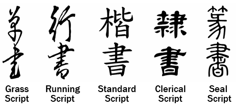
As with the previous entry, I’ll focus mainly on how Standard and Running Scripts (two of East Asian calligraphy’s five major branches) address the challenge of reconciling Stability and Vitality.

Achieving Stability
I previously described Stability as a quality encompassing these traits: form, order, balance, symmetry, consistency, predictability, sterility, objectivity, and sobriety.

Stability as I’m defining it usually isn’t evoked as a positive when discussing art; you probably wouldn’t describe artwork that you liked as being “consistent” or “predictable”. But Stability is a critical component of East Asian calligraphy (and most other art forms for that matter). In the very least, characters need to be legible*, which requires consistent, predictable ways of rendering their shapes and structures.

Beyond this most basic need, it is also generally believed that good calligraphy should be well-balanced & harmoniously composed, two qualities that fall under the canopy of Stability as I’m defining it.

Structural Integrity
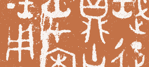
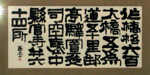
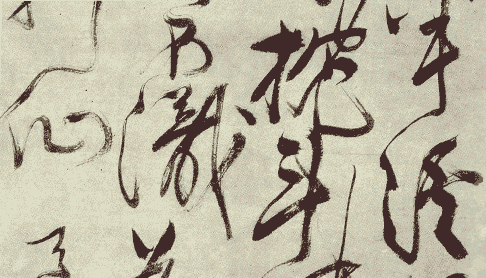
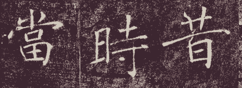
I didn’t really appreciate the structure of Chinese characters until I tried to recreate them myself. Below is a classic piece of calligraphy written in 653AD, and my own attempts at it:

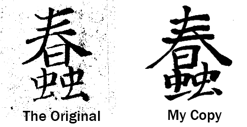
I’ve picked a particularly dismal example of my own calligraphy (from shortly after I first started)  to more clearly illustrate my point. But even now, my best efforts pale in comparison to what I’m modeling them after. My work is legible; any Chinese or Japanese person could read it. But it just doesn’t come together as a cohesive whole in the way that great calligraphy does.

The characters in the best calligraphic works appear to be structurally sound, like they could be used as the foundation of a building. That this internal stability is achieved using only a handful of precarious, unbalanced movements (i.e. the energy records that are lines) is truly remarkable.

A detailed description of how this stability is achieved is beyond the scope of this entry, so I’ll just briefly touch on a couple techniques:

Give and Take
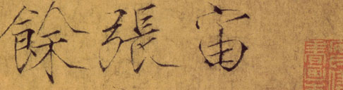
As the Chinese written language evolved, it sought to communicate more and more complex ideas and phenomena. Many of the new characters created were combinations of previously established characters. A good example of this is how multiple instances of the character for “tree” were used to form new characters to express “forest” and “woods”:

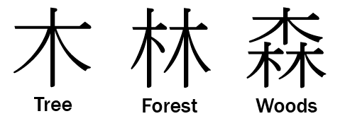
When the characters were joined to form new characters, they were almost never just squished together without alternation. Instead, as shown above, certain strokes in each character would be lengthened or shortened, in order to accommodate each other and create a more unified whole.

Modulated Strokes
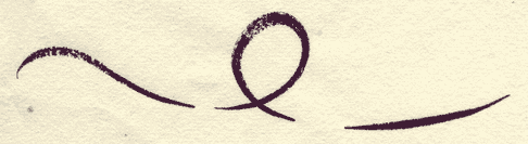
I previously wrote the modulated strokes, or lines with dynamic, varying widths, were used to create a sense of Vitality in calligraphic works.

But this technique also plays a critical role in enhancing the Stability of a work. As I wrote last time, the horizontal lines of characters written in Standard and Running Scripts tend to rise from left to right, both to facilitate ease of writing as well as to create a sense of imbalance which suggests movement:

It would at first blush seem impossible to reconcile Stability with the imbalance created by the right-rising technique. Calligraphers use fatter strokes in key places of the character, in order to ground it and introduce a sense of Stability to it.

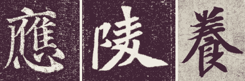
A good example of this can be found in the character for “heaven”, shown here in four different styles of Standard Script:

As you can see, the final stroke (the one that concludes in the lower right hand corner of each example) is significantly fatter than any of the others. This helps to ground and stabilize the right side of the character, which would otherwise appear skewed due to the right-rising horizontal lines.

Using these techniques, as well as countless others, calligraphers are able to have their cake and eat it too; to create characters that suggest both Vitality and Stability at the same time.

*****

I have a couple more things I’d like to write about East Asian calligraphy, but I’d like to take a little break from it. So the entries for the next week or two will be about something else. Stay tuned!

(*Regarding the “necessity” for legibility: actually, Grass Script is sometimes so chaotic that even calligraphy experts are unable to read it, and some avant-garde calligraphers create work that is truly inscrutable. But anyway…)

The Beauty of East Asian Calligraphy (2/3)

Last week I introduced my theory that the beauty of East Asian calligraphy lies in the balance it strikes between Vitality and Stability. I didn’t get much further than just introducing the theory in abstract, so for the next two entries I thought I’d go into a little more detail and provide a few specific examples of what I’m talking about. This week will focus on Vitality.

As I mentioned before, East Asian calligraphy is often divided into five main scripts:

Each script has its own aesthetic ideals & approaches to achieving balance. For simplicities sake, I’m going to focus on how Running and Standard scripts address this challenge. They were the last two scripts to evolve, and could (arguably) be considered East Asian calligraphy’s the most perfect expressions of balance between Vitality and Stability.

Expressing Vitality
As I’ve previously written, lines could be thought of as records of energy/movement. In this sense lines are, in their very essence, expressions of vitality. Calligraphers have developed a number of methods to emphasize this intrinsic quality in their work:

Right-rising
In Running and Standard scripts, horizontal lines are rarely perfectly even, but tend to rise from left to right. This tendency no doubt evolved for practical reasons; people can write more quickly and comfortably if they don’t have to worry about keeping their horizontal lines T-square perfect. But it helps to enhance the Vitality of the work as well, by creating a sense of imbalance that suggests movement.

Modulated Strokes
Early in its history, Chinese calligraphers seemed to idealize uniform line width, but as the art evolved, calligraphers began to recognize the artistic/practical advantages of varied width in creating a sense of liveliness in their work. Virtually all East Asian calligraphy is done with a brush, which more than any other writing tool allows for flowing changes in line width. By slowly pressing a brush into the paper as you move along, you can create lines that go from the width of an eyelash to an inch thick in a single movement, with dynamic results.

Invisible connections
A sense of energy/connection can be conveyed even in areas where the brush has left no mark. Take the following example:

Technically, these are three separate, distinct lines. But it is easy to see how the brush rose off and fell back into the paper in a single flowing movement. There is a sense of energy that flows from line to line that connects them as a whole.

This is an important principle in East Asian calligraphy, particularly in Running Script and Grass Script. One of my professors suggested that a character should be written in a single breath, without stopping to recharge the brush with ink. Stopping in the middle of a character would snuff out its life. It is widely believed that calligraphic works should be written in one sitting, to suggest a unified, energetic whole.

Next week’s entry will be about how a sense of Stability is achieved.