
I have two appearances coming up this month in Japan, if anyone’s interested:
On Sunday, December 11, 2011, I’ll be in Nagoya taking part in a panel discussion/release party for Aftershock: Artists Respond to Disaster in Japan, an anthology to benefit Japan disaster relief. The Facebook event page with all the details can be found here:
http://www.facebook.com/events/285808968131016/
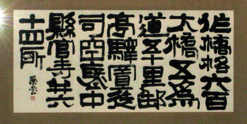
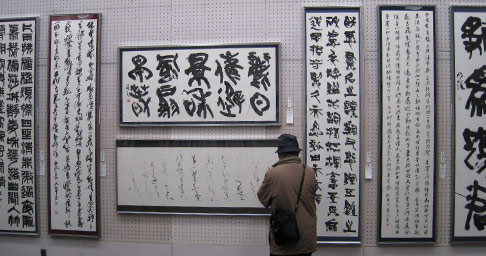
Then on Saturday, December 17, 2011, I’ll be at the Tokushima Museum of Literature & Calligraphy ( 徳島県立文学書道館 ). This is in conjunction with a calligraphy show that runs from 12/16 ~ 12/18. Don’t miss your big chance to see a piece of my sub-par calligraphy! I’m not sure what times I’ll be there to and from, but I’ll update with that later.
There doesn’t seem to be an online event page for the show, but the website for the museum can be found here (Japanese only):
http://www.bungakushodo.jp/index.html
Hope to see you there!