
Back in September I started a series of blog posts about East Asian calligraphy. Due to a number of mitigating circumstances I had to postpone the series for a few weeks, but I finally have time to come back to it now. Those who haven’t should read the previous entries in the series before this one:
1. About My East Asian Calligraphy Book
2. Thoughts about Lines
3. East vs. West
***
The subject of this entry and the next are my thoughts on what makes for “good” East Asian calligraphy.
I’ll start with an obvious disclaimer: this is all is completely subjective, and represents only my own personal opinions and tastes. It’s probably presumptuous of me to try to sum up the beauty of this 3000 year old art tradition in just a few paragraphs, especially since I’m relatively new to the field. But I figure since East Asian calligraphy doesn’t have a Western equivalent, maybe my thoughts on the subject might in some small way help the reader understand the art. In any event, take the following with a grain of salt.
So now that that’s out of the way, let’s get into the crackpot theories/sweeping generalizations:
***
Doing vs. Being
I tend to think of East Asian calligraphy in terms of a yin-yang-esque dichotomy, so I’ll start off by introducing that. This model is of my own design, but is heavily informed by similar theories I’ve been introduced to during the course of my studies.
For months I’ve been trying to think up clear, succinct terms for the two sides of my dichotomy, but so far haven’t been satisfied with anything I’ve come up with. So just to call them something, I’ve provisionally settled on Vitality and Stability. But these terms don’t really sum up what I’m trying to express, so let me describe each of them in turn.
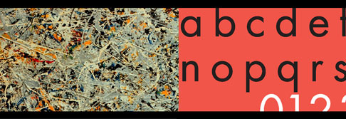
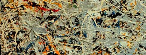
By Vitality, I mean a quality encompassing these traits: energy, movement, spontaneity, messiness, creativity, liveliness, subjectivity, and intoxication. A visual equivalent of this quality might be a Jackson Pollock painting, with all its raw, visceral intensity.
On the other hand is Stability: form, order, balance, symmetry, consistency, predictability, sterility, objectivity, and sobriety. A visual equivalent of this quality might be Futura, the san-serif typestyle. Inspired by the German Bauhaus movement, Futura was painstakingly designed to remove any suggestion of flourish or human imperfection. The straight lines perfectly straight, all the curves are geometrically precise, and everything is uniform, even and symmetrical.

So to my mind, the beauty of East Asian calligraphy lies in how it strikes a balance between these two qualities; in the way it expresses both the uncontained excitement of a Jackson Pollock painting and the steady clinical clarity of a Bauhaus era typestyle.
When a calligrapher favors Vitality too heavily, they end up with something that, while incredibly energetic and vibrant, is in many ways was the equivalent of tv static, without any sort of clear representation or message. Go too far towards Stability, and you’ll end up with something very clear and readable, but that feels cold and clinical, with no sense of life to it.
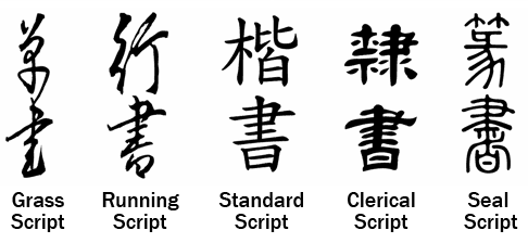
Each of East Asian calligraphy’s five main scripts has its own answer as to where that balance should lie. Grass Script tends towards the Vitality side, Seal Script tends towards Stability, and the other three scripts, Running, Standard and Clerical, fall at various points in between.

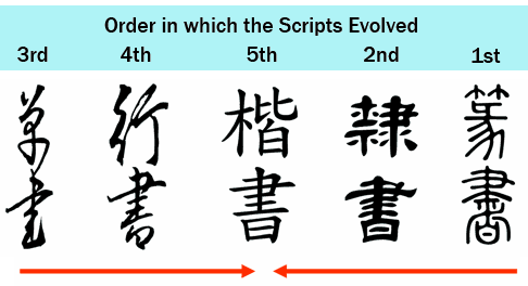
What’s interesting is if you look at the order in which these scripts evolved. As new scripts emerged, they moved closer and closer towards a more perfect balance between Vitality and Stability.
Continued Next Week