Creating Tonoharu #10–Final Edits


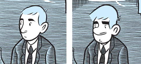
Pictured:
Tonoharu’s protagonist, before and after graphical edits

This is the tenth (and final) entry in a series of posts describing my process for creating my graphic novel Tonoharu. This post deals with the “post-production” edits (for lack of a better term).

I’ve been drawing comics since I was in junior high. I’ve experimented with all sorts of formats & sizes, drawing styles & materials. Most of these experiments were dead ends, but little by little (by the process of elimination if nothing else) they helped me to realize what sort of comics I wanted to make. By the time I started working on Tonoharu in 2003, I had a fairly strong sense of what direction I wanted to go in, not only for Tonoharu, but (presumably) for the works that will follow it.

But that isn’t to say that I had all the fine details ironed out. Daydreaming and theorizing about the comics I wanted to draw only took me so far; only by committing something to paper was I able to see what worked and what didn’t in practice. For the things that didn’t work out, I did my best to make them right after the fact, via graphical and textual edits.

Editing the Pictures
When I started drawing Tonoharu, I hadn’t completely settled on what the characters would look like. For the main character in particular, I had a hard time capturing the qualities I wanted express in his face, which was unfortunate because he is in practically every panel. But as I drew him over and over, his facial features slowly evolved, and he started looking more and more as I had vaguely imagined him in my mind’s eye.

The problem was, the drawings of him from early in the book looked almost nothing like the final character design (as can be seen in the before and after shot at the beginning of this entry). I mean, I’m fine with some variance from drawing to drawing, but he looked like a completely different person.

So I ended up redrawing the faces I didn’t like, and frankensteining them into the original drawings using Photoshop. This took months and months of dedicated work, and became more encompassing as time went on. Ultimately virtually every face of every main character in Tonoharu: Part One was edited in this manner at least once, in some cases two or three times.

Okay, I’ll admit, I’m an insane perfectionist, and I got a little carried away. But I think being so nitpicky about the characters faces has given me a better understanding of how to do it the right way, and as a result I won’t need to do as much digital plastic surgery to the characters in Tonoharu: Part Two (maybe only half as much… sigh).


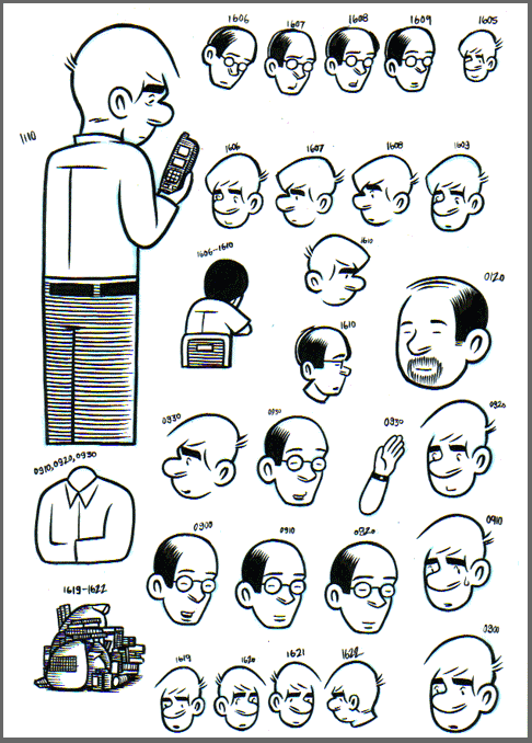
Pictured: A sheet of revised faces. Yes, I’m crazy.

Editing the Text
I have a tendency to be too wordy in my comics (and in my blog entries) and I’m always trying to curb that. It’s possible to make a good comic that’s wordy of course, but after a certain point it starts to resemble a picture book, or an illustrated screenplay. Comics that really play off the strengths of the medium tend to use words very economically; often with ten or less words per panel, and only rarely over fifteen. Take a look at any random Peanuts comic and see what I mean.

So as I edited the text of Tonoharu: Part One, my rule of thumb was to try to keep the number of words per panel under fifteen (or ideally, under ten). And unless I absolutely couldn’t help it, I tried not to go over twenty words per panel at absolute most. I was always looking for ways to tighten up scenes and make them less wordy. Iris Murdoch once said “To be a good writer, you have to kill your babies”, and that’s what editing the text was like for me. I would fret over every clever turn of phrase I was considering editing out, but nine times out of ten I realized the work was better in its absence, and wouldn’t dream of putting it back in once it was gone.


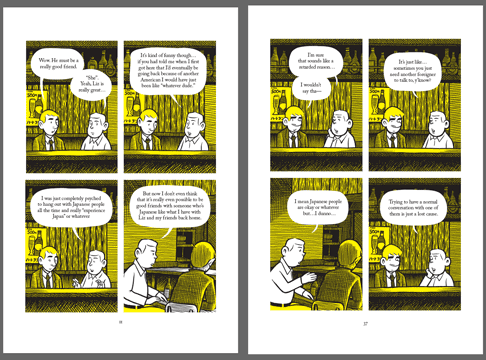
Pictured: The same page, before and after textual edits. I know it’s too small to read the actual words, but as you can see, the “before” version is a virtual wall of text, with the “after” version having been trimmed down considerably.

****
Well, I guess that just about wraps the Creating Tonoharu series up. There were a few other things I wanted to write about in more detail; maybe when Tonoharu: Part Two is close to being done, I’ll revisit Creating Tonoharu and fill in the blanks. But for now, I’m sick of writing about my creative process, so I’m declaring the series provisionally closed.

As such, next Friday’s entry will be about something completely different. Stay tuned.

Creating Tonoharu–#1: Laying The Groundwork
Creating Tonoharu–#2: The Idea
Creating Tonoharu #3–Writing the Script
Creating Tonoharu #4–The Design (1/3)
Creating Tonoharu #5–The Design (2/3)
Creating Tonoharu #6–The Design (3/3)
Creating Tonoharu #7–The Drawing
Creating Tonoharu #8–Inking
Creating Tonoharu #9–Computer Stuff
Creating Tonoharu #10–Final Edits

  • Al

    Wow. That’s a lot of work. As someone who occasionally spends hours cleaning up an image in photoshop, I can sort of relate.

    This series was really cool. It’s never a bad thing to understand how much work goes into a project.

    This is probably going to crush your soul a little bit, but a friend of mine (one who isn’t accustomed to reading graphic novels) read through Tonoharu Part 1 in about 15 minutes. I couldn’t believe it.

    I think a series like this, where you explain the process of creation, helps foster an appreciation for the art form. After reading this series, I realize that I probably also read Tonaharu too fast.

  • Lars Martinson

    Heya Al,

    Thanks for the comment. Glad you enjoyed the series.

    I have mixed feelings about your friend’s quick read-through. On one hand, I strived to improve readability as I made my edits, so I think it’s great that it can be read through with such ease, without the super-detailed drawings becoming intrusive & distracting.

    On the other hand, it is sort of a bummer to think that four years of work can be zipped through so quickly. The first panel on page 43 (of a busy train station, for those that don’t have the book) took me three days to draw, but is probably looked at by the average reader for literally less than a second. But that’s the way it goes. Chris Ware once said that the ratio between time depicted in a comic and the time it takes to create it is 4000 to 1. If anything, I’m starting to think that’s an understatement!

    On a side note, while I did try to make Tonoharu a book that could be read through quickly & easily, I also put in details that I hope would reward more careful readings. The prologue in particular offers many hints of what’s to come.

    Lars

  • Patrick Reynolds

    Thanks for doing this. I’ve enjoyed learning. With stories, I keep thinking that the best tales guide the imagination and don’t always need, or get, too much ‘page viewing’ time – they carry the reader, if it’s working, and the imagery will stick in the mind for long, long after. And, on your first graphic novel – congratulations!

  • I found your website through the JetWit website and I really enjoyed your blog and the walthrough of your process in creating your comic. I think you might have some kind of OCD to work on something with the level of detail and care that you have :-) Good luck with everything.

  • Lars Martinson

    Thanks! Yeah, Tonoharu brings out my OCD tendencies for sure. Once Tonoharu is done, I’m going to try my hand at a looser, quicker style; drawing in the Tonoharu style just takes too damn long.

    Checked out your website btw; good stuff!
    Lars

  • Jennae

    Wow.

    I haven’t read Tonoharu yet, but after reading this series about its creation I definitely want to get my hands on my very own copy as soon as I can!

    Seriously – You have no idea how grateful I am that you created this small series about your process. Besides being entertaining and amusing – it provides me (and anyone else) with a much deeper understanding and in turn, a greater appreciation for the amount of work you put into your craft. Also helps me gauge just what sort of timeframe I need to be thinking of for my own work.

    One of my professors at my college actually gave me the link to your site, specifically this blog entry about your creation process. I’m so glad he did. I would actually love to read even more on your work process. I learned a lot just from the entries you have – Like page size! I never even thought about what page size I should use…or about the CMYK color instead of spot color.

    I’ll definitely be looking at your art, your work, and your site for more inspiration and guidance as I travel down my own path towards my own dreams of publishing a graphic novel as well. (Maybe a few novels…..)

  • Lars Martinson

    Hey Jennae, thank you much for the kind words!
    I might mention, though, that this guide is probably a bit out of date now; might be good to focus more on optimizing artwork digital edition, since that seems to be the wave of the future (for better or for worse). Also, it’s probably not a good idea to emulate my approach, since it takes such an ungodly long time to finish anything. I’ve now been working on Tonoharu for like eight years now. O_0
    But glad you enjoyed the series!
    Lars

  • Discovering your blogs about Tonoharu was really a great stroke of luck. It’s actually a little eerie because I am planning to partake in the JET programme as well starting in 2014 for at least 3 years and plan, very much like you did, to work on my own graphic novel in the spare time afforded to me. Quite the similarity!

    Still I have quite a different background from you (at least from what I’ve read in these few blog posts). I’m already learning Japanese in
    my spare time (which should be useful to avoid the awkward social situations faced by your character/you) and my current degree course is also fine art, though with the freedom afforded in that course I have discovered my true calling: graphic novels.

    My own idea for my own graphic novel is actually even more insanely ambitious than you’re already highly impressive work, not only on a
    design level but conceptually as well. My style is very detailed pencil drawings and my design philosophy is ‘not sacrificing detail for expediency”, so I’m facing probably decades to achieve what I want to (provided I can keep up my enthusiasm for the work).

    I can certainly relate to your philosophy of focusing the readers attention on the story first and foremost, though for my own particular story your approach to panelling is definitely too formulaic. I still obviously have a lot of aspects to consider in much more depth, and I’m certainly going to have plenty of more time to think about them (the next 5 years just for starters!) but like you, I’m willing to be a mostly penniless artist (or at least a well-paid ALT) if it means I can live out what I consider my real purpose in life.

    You’re blogs have given me many things to consider further, especially readability and the integration of the text etc and I’m very much looking forward to reading Tonoharu Parts 1 and 2 (they’re ordered and awaiting arrival) and not only getting some insight into the JET Programme (albeit partly fictional) but taking in the detail of your work as well. Thanks!