
About this design doc
This is intended to explain to potential programmers what I’d like to do for this visual novel project.
I am an artist, not a programmer. But the underlying mechanics of how things work fascinate me, and I figured it would be a good mental exercise to try to think about how all the pieces might fit together.
So this design doc includes not only what I want to do, but also half-formed, rough ideas about how it might be achieved. But again I’m not a programmer, so if there’s a better way to do something than my proposed “solution”, I’d be fine with it being implemented completely differently.
Also, I’ve tried to keep the scope reasonable, but maybe some of what I’d like to do would be unreasonably difficult to implement. Again, as a non-programmer I’m not sure what’s easily done and what’s a massive pain. Anyway, I’d be receptive to changing some details in the event that what I’ve proposed isn’t reasonable to code.
Project Overview
A linear visual novel that stylistically evokes indie comics, b&w cartoons, and silent movies. I made a YouTube video that explains (in very general terms) what I’m going for, which can be viewed here: https://youtu.be/37HjhnnaGns
The way text and images are displayed varies a bit from visual novel convention, as detailed throughout this doc.
Game resolution: 1080×1920
Engine: Ren’py (Probably. I’ve written this doc assuming Ren’py will be used, and occasionally reference Ren’py scripts (which I’ve colored green). But I’m open to doing it in another engine if Ren’py won’t work for what I want to do.)
It will be somewhat similar to a test visual novel I made in Unity, called “The Grandfather Paradox”, which you can see here: https://youtu.be/FX2DsZngAvo
A couple key differences: this new visual novel won’t have posable character bodies (I figured that be too hard to implement in Ren’py, especially for my first attempt). So I’ll be custom drawing each character body pose. Also this new one has a “talking head” view for character closeups (detailed below) that I didn’t have in “The Grandfather Paradox”.
Project Files
Here is a zip file containing files relevant to this project:
[ larsVNfiles.zip 2.07MB ]
It includes:
1) Image files for testing
2) The fonts
3) And script.rpy file for testing. (I didn’t include or modify other Ren’py files because I didn’t want to make too many changes in case I ended up screwing things up more than helping.)
References to images included in the zip file below have been colored green. More information about the image file properties are near the bottom of this design doc in the “Variables for [stageView] Foreground Images Sample Files” section.
Note About Color
With only a few exceptions, almost all of the images are in b&w or grayscale. I would like to colorize them dynamically using im.matrix.colorize (or whatever would work best).
The two main colors are [contextualBlack] and [accentColor]. Other colors will be based on these two colors. For example:
[accentColorWhite] would be a very light tint of [accentColor]:
Color(accentColor).tint(.2)
Characters will have a very subtle custom color variant based off of [accentColor]. For example:
define colorizeOdetteGrey = im.matrix.colorize(Color(Color(accentColor).interpolate((255,130,130), 0.13)).tint(0.9), accentColorWhite)
(I’d be fine implementing that differently if there’s a better way to do it, that’s just for example.)
I would like to be able to change the values for [contextualBlack] and [accentColor] throughout the story to vary the way each scene looks. The values for [contextBlack] and [accentColor] will usually change while the [timeChangeSubview] screen is showing. (More about [timeChangeSubview] later.)
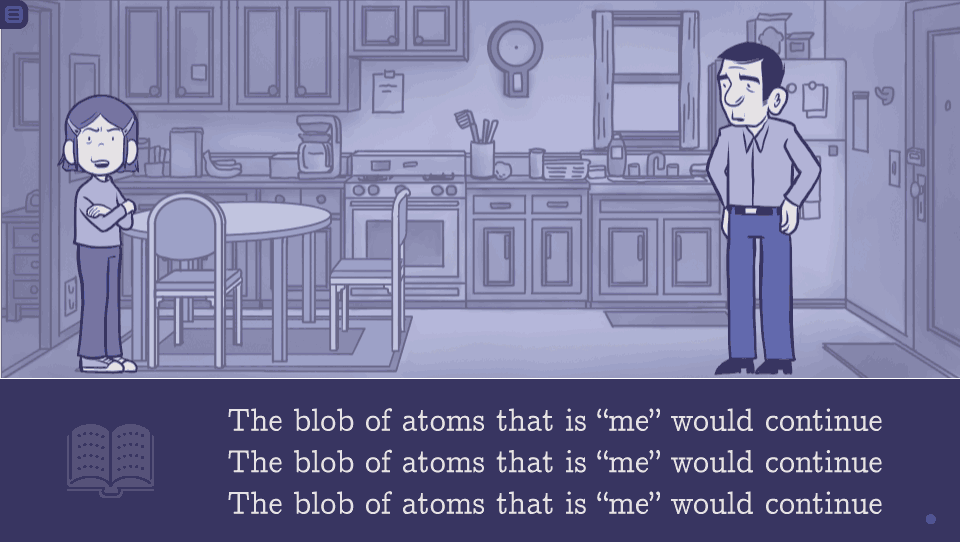
Color change example: in a daytime scene, [contextualBlack] might be set to Color((78,53,39)) and [accentColor] might be set to Color((176,151,112)), and it would look like this:
And in a nighttime scene [contextualBlack] might be set to Color((56,53,97)) and [accentColor] might be set to Color((74,84,166)), and it would look like this:
Reader Interaction
Since this is a linear visual novel, reader input is limited to advancing text, going back to previous text, and accessing the menu to change settings/save/load.
The first time the story is started, a screen should appear that explains the controls (click images to see at full resolution):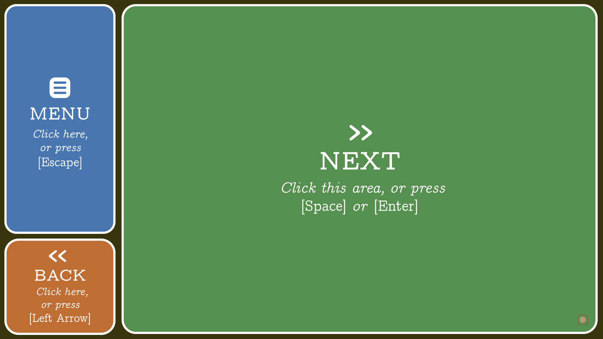 Above: Control Screen
1) Menu Button, positioned at the top left of the screen. Allows access to the menu.
( UIImages/controls_menu-white.png ) with ( UIImages/controls_menu-color.png ) for the bg
2) Back button, positioned at the bottom left of the screen. Pressing it makes the game return to the previous text block. ( UIImages/controls_back-white.png ) with ( UIImages/controls_back-color.png ) for the bg
3) Next button, covering the right side of the screen. Used to advance the text. ( UIImages/controls_next-white.png ) with ( UIImages/controls_next-color.png ) for the bg
4) [ctcIcon] “Click to continue Icon”, the dot in the bottom right corner of the screen.
The buttons on the control screen should be a 50% opacity. When the player mouses over one of them, it should go up to 100% opacity. Clicking on “MENU” should take you to the menu (of course), clicking on “NEXT” should start the story. Clicking on “BACK” should make a [bottomWordBubble] and a [bottomWordTail] appear that says:
“Clicking here (or pressing [left arrow]) will usually show you the last line of text in the story. (It doesn’t here because this is the first screen.)” Clicking anywhere will make that word bubble disappear.
When the reader starts the visual novel itself: On the left side of a screen will be a small icon called [menuNub]. It will be comprised comprised of two components, ordered from back to front:
1) [MenuNub] bg: ( UIImages/menuNub_bg.png ) should be set to [contextualBlack]
2) [MenuNub] icon: ( UIImages/menuNub_icon.png ) should be set to [accentColor] (or maybe a slightly saturated variation of [accentColor]).

Above: The great [menuNub] in all its glory. (See images below in “Text Positioning” for examples of positioning.)
It isn’t possible for the reader to interact with [menuNub]; it exists just to provide a visual reminder to the reader that mousing over to the left side of the screen lets them access the menu.
When the mouse is on the right part of the screen, there will be no visual cue. But when the mouse moves over to the left edge of the screen, a menu/back sidebar should fade in, and [menuNub] should fade out:
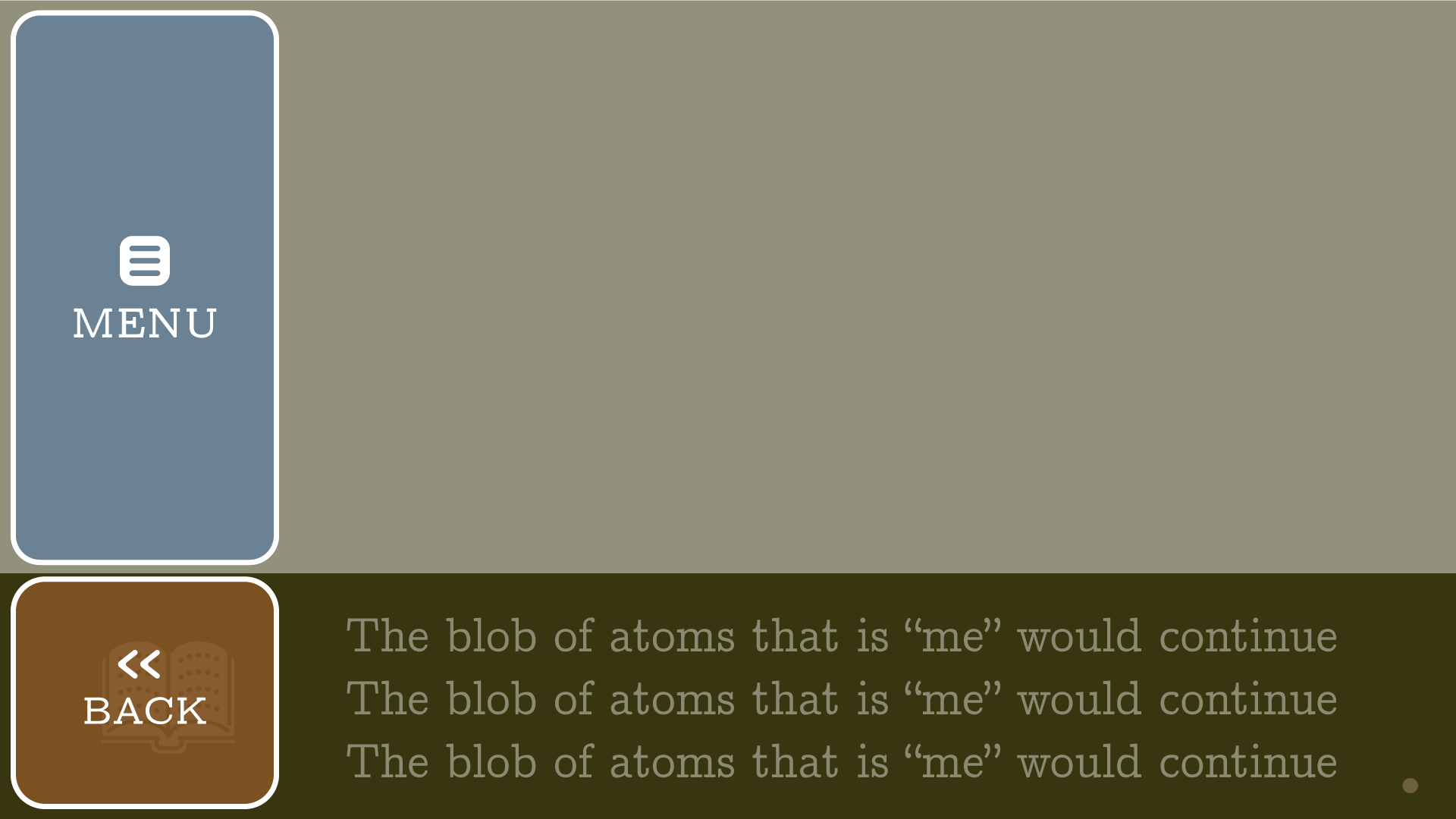
It will be composed of the following elements (ordered from the bottom to the top):
1) a [contextualBlack] solid that fills the whole screen, at 55% opacity. (This will allow you to see the game in the background, shown here as the “blob of atoms” text.)
2) Menu Button. Comprised of ( UIImages/side_menu-white.png ) with ( UIImages/controls_menu-color.png ) for the bg color. Positioned at the top left of the screen, at 50% opacity. Allows access to the menu.
3) Back button. Comprised of ( UIImages/side_back-white.png ) with ( UIImages/controls_back-color.png ) for the bg color. positioned at the bottom left of the screen, at 50% opacity. Pressing it makes the game return to the previous text block.
Again, when the reader mouses over a button, it should go to 100% opacity. If the reader mouses away from the left edge of the screen, the sidebar should fade away, and [menuNub] should fade back in.
Displaying Text
Font: cmunorm.ttf for normal text, cmunoti.ttf for italics, and cmunobx.ttf for bold
Size: 64
Text speed: default preferences.text_cps = 50
Text Color and Style
Text will be displayed either as [dialogue] or [narration].
For [dialogue], text will be [contextualBlack], and will be displayed inside an [accentColorWhite] word bubble. There will be an [accentColorWhite] word bubble tail pointing to whatever character is talking.
For [narration], text will be displayed as [accentColorWhite], with the background being [contextualBlack].
Text Positioning
Text will be displayed in one of four different vertical positions depending on context: [topText], [middleText], [timeChangeText], and [bottomText]. For all text except [timeChangeText], I’d prefer if the text’s vertical position would shift slightly based on if it’s 1, 2, or three lines of text, so that it appears centered in the allotted text block space.
[topText] is only used when characters are talking in [talkingHeadSubview]. It will only be used for [dialogue]. Three variations shown below:
 Above: [topText] [dialogue] (one character):
1) [topWordBubble]. ( UIImages/wordballoon_top.png ) Color should be set to [accentColorWhite].
2) Text Block.
3) [ctcIcon] “Click-to-continue icon” . (Described below in the “[ctcIcon] (“Click To Continue” Icon) Animation” section)
4) [topWordBubbleTail]. ( UIImages/wordtail_top.png ) Color should be set to [accentColorWhite].
5) [menuNub].
6) [talkingHeadChara] (Defined below in “Displaying Characters” section)
 Above [topText] [dialogue] (two characters, left character talking):
1) [topWordBubble]. ( UIImages/wordballoon_top.png ) Color should be set to [accentColorWhite].
2) Text block.
3) [ctcIcon] “Click-to-continue icon” .
4) [topWordBubbleTail]. ( UIImages/wordtail_top.png ) Color should be set to [accentColorWhite].
5) [menuNub].
6) Left [talkingHeadChara].
7) Right [talkingHeadChara] (flipped horizontal)
 Above [topText] [dialogue] (two characters, right character talking):
1) [topWordBubble]. ( UIImages/wordballoon_top.png ) Color should be set to [accentColorWhite].
2) Text block.
3) [ctcIcon] “Click-to-continue icon”.
4) [topWordBubbleTail] (flipped horizontal). ( UIImages/wordtail_top.png ) Color should be set to [accentColorWhite].
5) [menuNub].
6) left [talkingHeadChara].
7) right [talkingHeadChara] (flipped horizontal)
[middleText] is used when text is displayed by itself in the center of the screen (both vertically and horizontally). It should look similar to silent movie inter-titles. It will always be [narration].
 Above [middleText] [narration] (for text only)
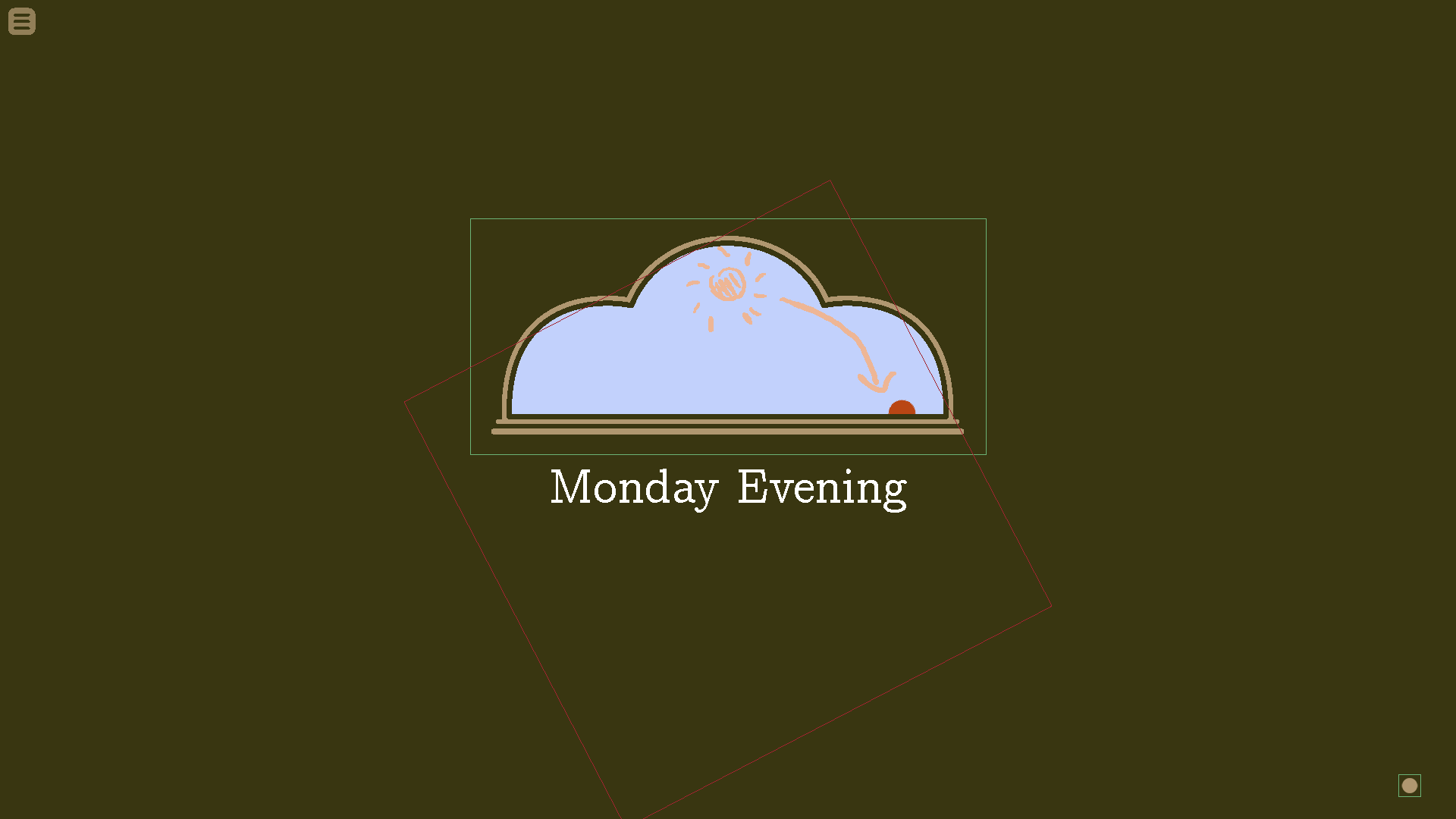
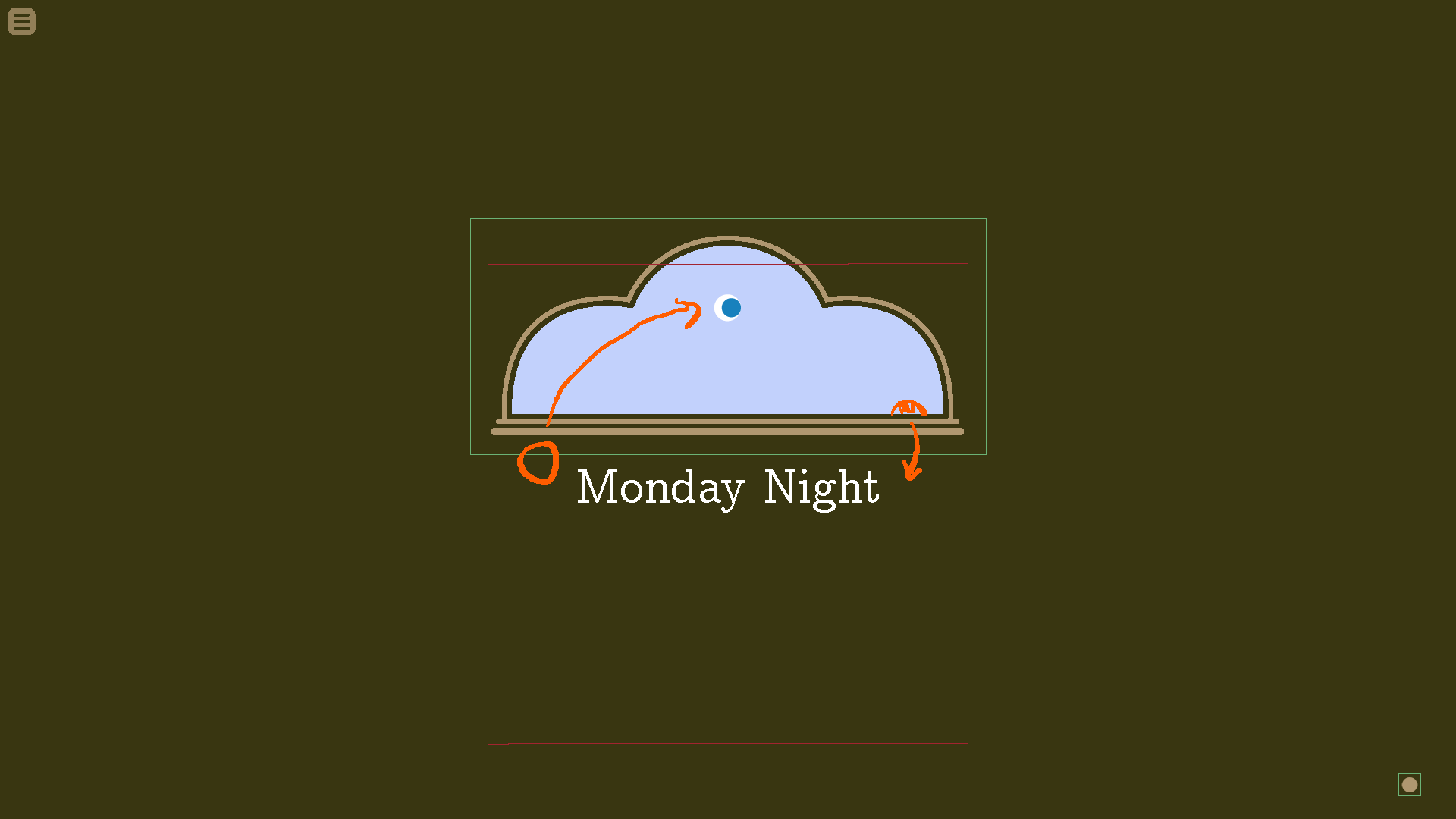
[timeChangeText] is used to show a when the day, time and/or location changes in [timeChangeSubview]. It’s used in between scene transitions.
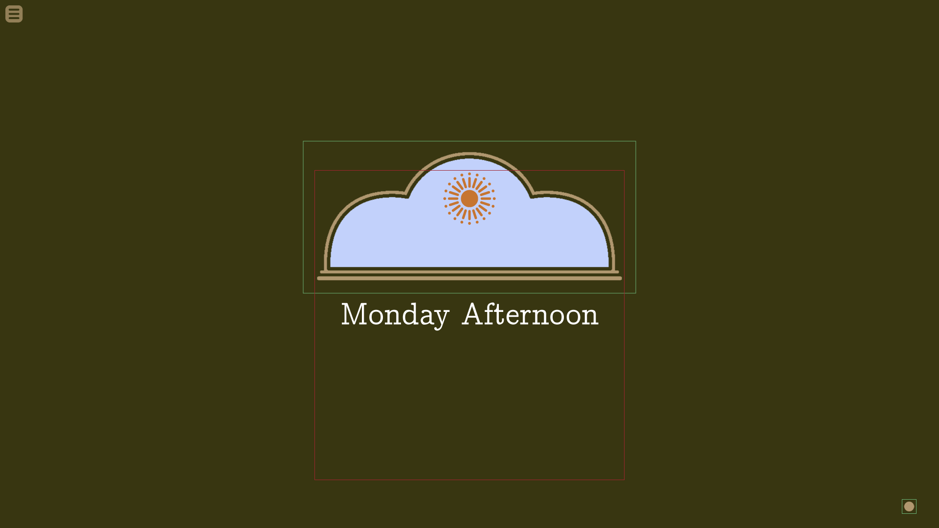
Above [timeChangeText] [narration]
Blue Part: This will show the sky to show the appropriate time of day. It will fade from one sky to another when the scene changes.
Green outlined element: Sky Frame. ( UIImages/skyframe.png ) The “frame” just above the sky image.
Red outlined element: Sun/moon bounding box. The sun or moon will rotate in and out of frame as appropriate.
Text: centered at position shown.
(All of this is described in more detail in the “Changing Scenes with [timeChangeSubview]” section below.)
[bottomText] can be either [dialogue] or [narration] depending on context. [bottomText] is used in the following three cases:
1) for all text in [stageView]*,
2) for [narration] in [talkingHeadSubview]*,
3) for all text in [visualAidSubview]*.
(*Views and subviews defined below)
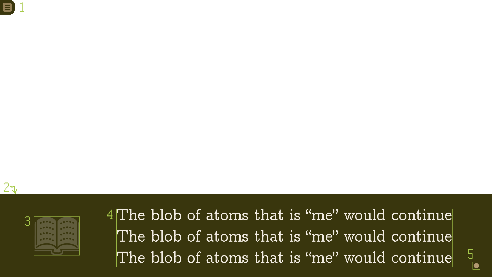 Above: [bottomText] [narration]:
1) [menuNub].
2) [contexualBlack] bottom bar, 324px from the bottom edge.
3) [bookWingding]. ( UIImages/bookwingding.png ) Color should be set to: Color(contexualBlack).tint(.75)
4) Text block.
5) [ctcIcon] “Click-to-continue icon”.
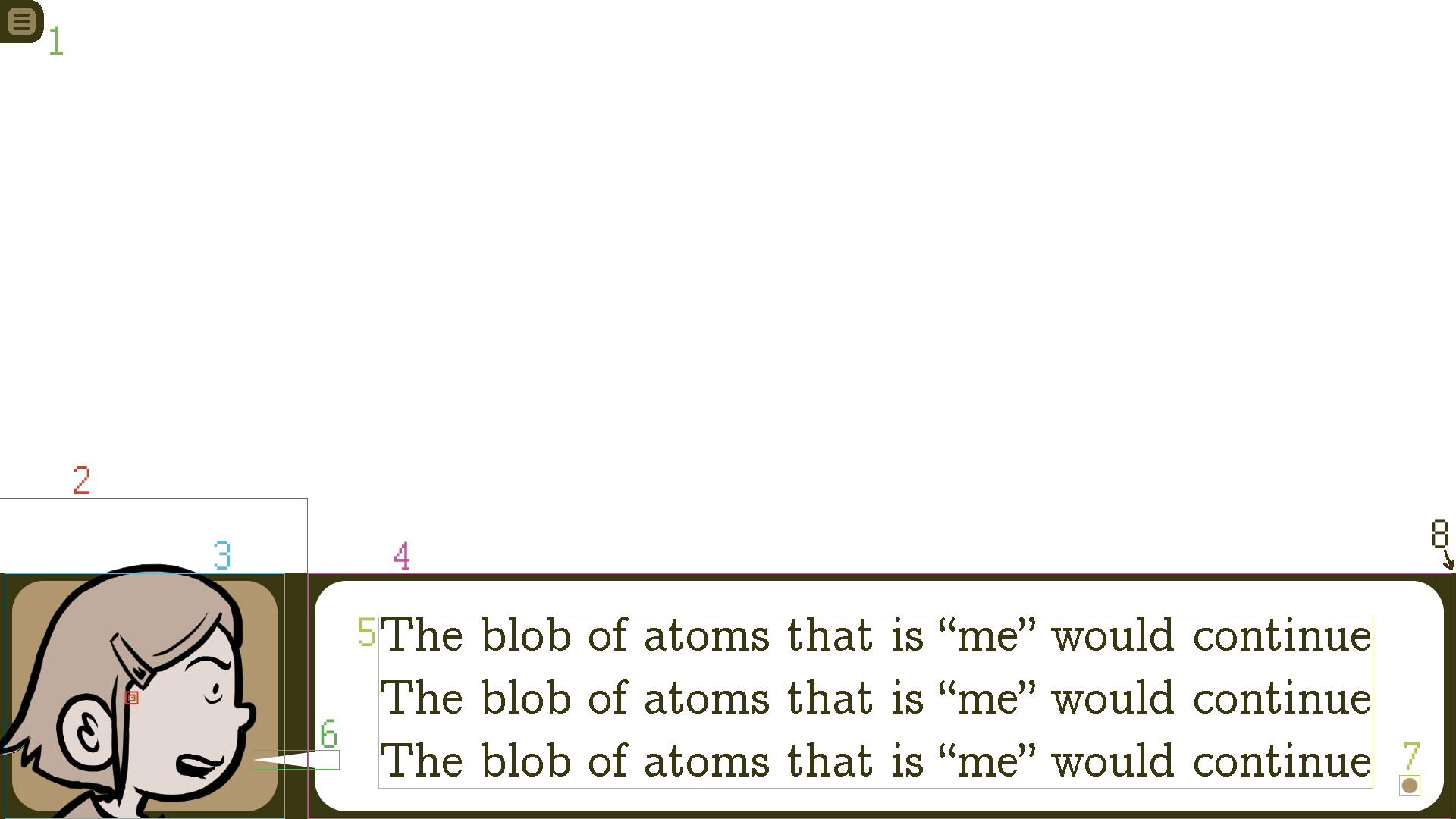 Above: [bottomText] [dialogue]:
1) [menuNub].
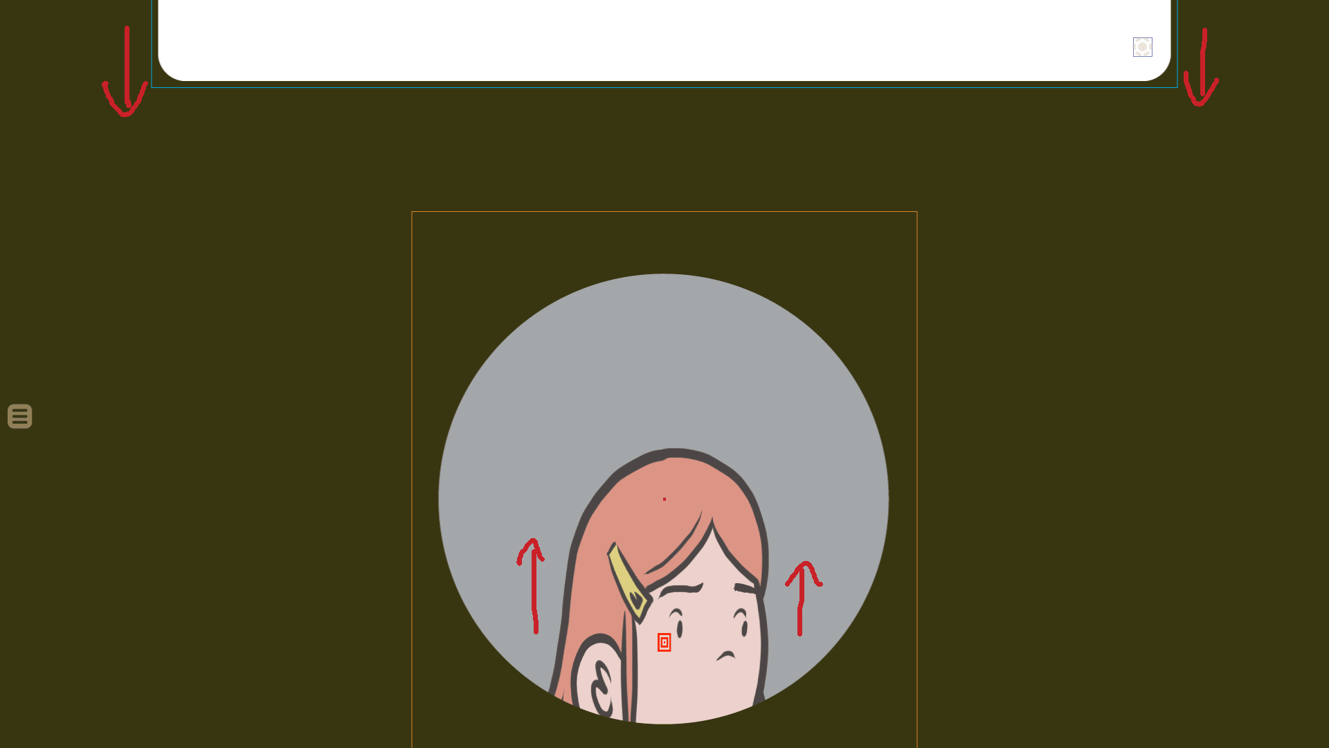
2) [sideImageChara] bounding box. The three red squares inside the head designate the center of [sideImageChara].
3) Side image bg ( UIIlmages/sideimagebg.png ). Should be set to [accentColor].
4) [bottomWordBubble]. ( UIImages/wordballoon_bottom.png ) Color should be set to [accentColorWhite].
5) Text block.
6) [bottomWordTail]. ( UIImages/wordtail_bottom.png ) Color should be set to [accentColorWhite].
7) [ctcIcon] “Click-to-continue icon”.
8) [contexualBlack] bottom bar, 324px from the bottom edge.
Displaying Characters
(In naming character elements, I’ll be shortening “character” to “chara”.)
Characters are displayed in three ways depending on context:
1. [stageChara], which are full-bodied characters shown in [stageView]
2. [talkingHeadChara], which are large character closeups used in [talkingHeadSubview]
3. [sideImageChara], which are used for side images for [bottomText] [dialogue] (as shown in the image above).
The character’s head will usually be an instance of [charaHead]. This will be the topmost layer of the character. The layer directly below [charaHead] will either be [charaBody] or [charaShoulders].
About [charaHead]
[charaHead] is comprised of three layers, ordered from bottom to top:
1. [charaHeadColors] The greyscale “colors” that fill in the head. Should be set to the [accentColor] variant for that character. For example: define colorizeOdetteGrey = im.matrix.colorize(Color(Color(accentColor).interpolate((255,130,130), 0.13)).tint(0.9), accentColorWhite)
2. [charaHeadOutline] The lines that make up the outline of the head. Should be set to [contextualBlack].
3. [charaFace] The expression the character has. Should be set to [contextualBlack].
About [charaHead] head angle: Each png image file for [charaFace], [charaHeadOutline], and [charaHeadColors] contain three variations based on the angle of the head: [profileFace], [3/4thFace], and [frontFace]. The images should be cropped so only one of is displayed at a time. The anchor point used for positioning for [charaHead] should always be at the center of each cropped section.
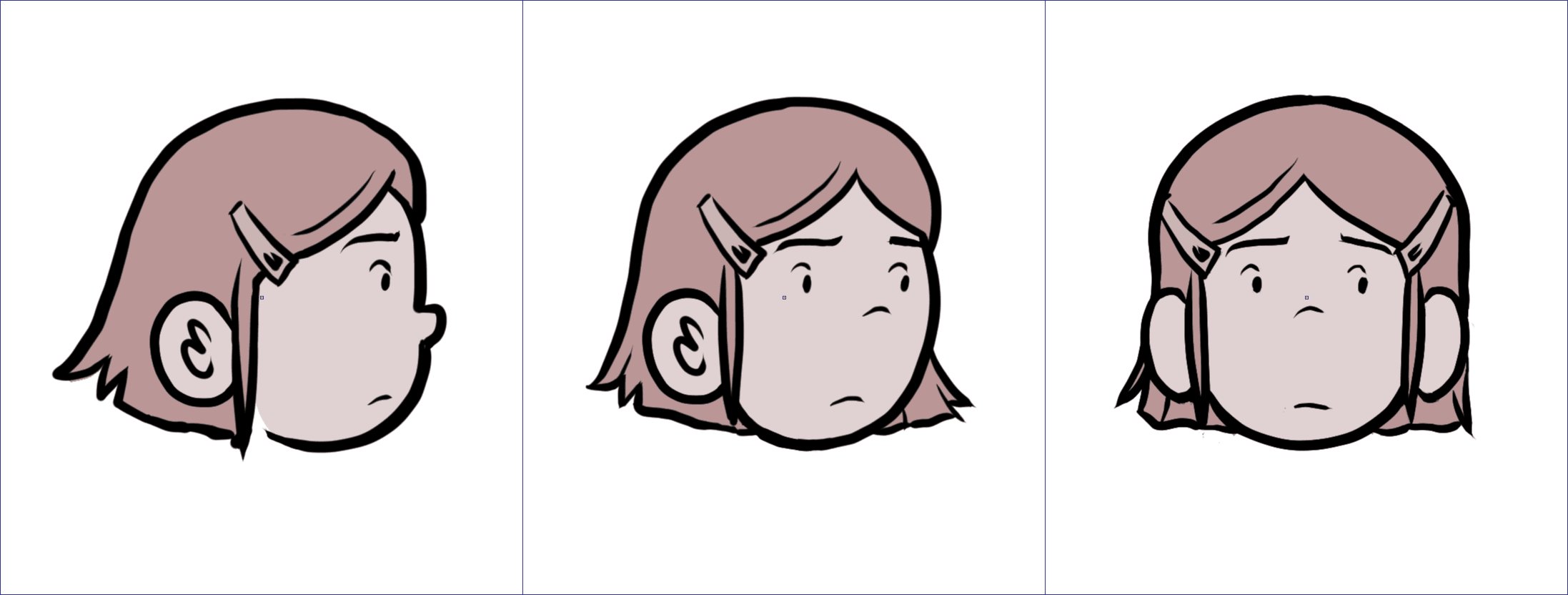
Above: assembled [charaHead] for character Odette. The 1st one is [profileFace], is 2nd is [3/4thFace], and the last one is [frontFace]. All three head angles are contained in one image file.
When [profileFace] is needed, use only the first 1/3 of the image file.
When [3/4thFace] is needed, use only the middle 1/3 of the image file.
When [frontFace] is needed, use only the last 1/3 of the image file.
About [charaShoulders]
[charaShoulders] are used, along with [charaHead], to form [talkingHeadChara] and [sideImageChara].
[charaShoulders] is comprised of two elements, ordered from bottom to top:
1. [charaShouldersColors] The greyscale “colors” that fill in the shoulders. Should be set to the [accentColor] variant for that character.
2. [charaShouldersOutline] The lines that make up the outline of the shoulders. Should be set to [contextualBlack].
Each image file for [charaShouldersOutline], and [charaShouldersColors], have three variations based on the angle of the head: [profileFace], [3/4thFace], and [frontFace]. The images should be cropped so only one of these is displayed at a time.
When [profileFace] is needed, use only the first 1/3 of the image file.
When [3/4thFace] is needed, use only the middle 1/3 of the image file.
When [frontFace] is needed, use only the last 1/3 of the image file.
About [sideImageChara]
These are images used to denote who is talking for [bottomText] [dialogue]. (See “[bottomText] [dialogue]” image above.) It is composed of three parts (ordered bottom to top):
1) side Image bg. ( UIIlmages/sideimagebg.png ). Should be set to [accentColor].
2) [profileFace] [charaShoulders] scaled down to 63.4%
3) [profileFace] [charaHead], with appropriate expression, scaled down to 63.4%
(More information about [talkingHeadChara] found below in the “About [talkingHeadSubview]” section.)
About [charaBody]
Details about [charaBody] are described below in the “About [stageChara]” section.
About Display Views
There are two main ways graphics are displayed: in [stageView] and [vingnetteView].
[stageView] is the main view, and [vingetteView] is a secondary view. Usually [vingetteView] is used for brief asides, and then the view returns to the main [stageView]. So [stageView] background images and foreground images and their positions should persist (on a lower layer) even when the view temporarily switches to [vingetteView]. (Until the scene completely ends.)
About [stageView]
This view will show an entire room (or “stage”) with [stageChara] (i.e., full-bodied characters) and [props]. It will be similar to the view used throughout “The Grandfather Paradox”, a test vn I did in Unity: https://youtu.be/FX2DsZngAvo
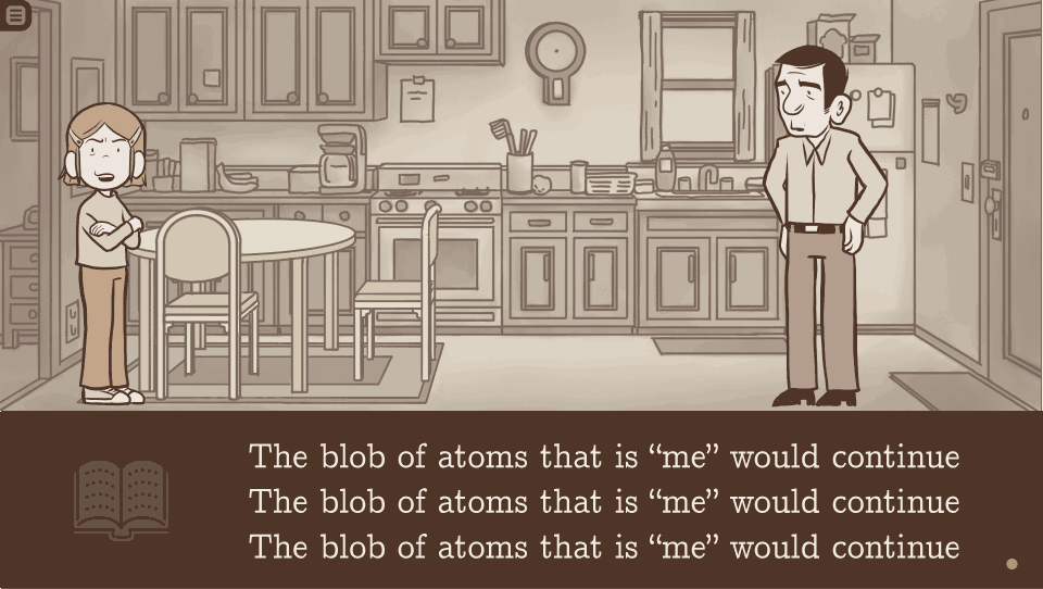
Above: Sample image showing the kitchen stage, with [bottomText] [narration]. The kitchen is the background, the table and chairs are foreground [props], and the two people are instances of [stageChara]
When in [stageView], text will always be positioned as [bottomText].
About the Stage
The stage itself will be composed of both background images and persistent foreground [props] (such as tables and chairs).
The background images should be aligned with the top left corner of the screen. Position(align=(0.0,0.0))
They are comprised of three or four parts, listed here from bottom to top:
1. The backmost layer for showing the sky or what’s outside the window. In some cases, this layer may not be present. When it is present, it might be an image or a solid color.
2. The main greyscale part of the background. It should be set to im.matrix.colorize(contexualBlack, Color(accentColor).tint(0.4))
3. The lines of the background. They should be set to im.matrix.colorize(Color(contexualBlack).tint(.76), accentColorWhite)
4. A position grid, with an adjustable opacity value. ( UIImages/placementgrid.png ) (This will only be used during development. It will be removed or have its opacity turned to 0 for the final release.)
(The persistent foreground [props] will be a part of the Stage, but will be in the foreground, allowing [stageChara] and other [props] to be placed both in front of or behind them.)
All [props] should be colored with im.matrix.colorize(accentColor, Color(accentColor).tint(0.25)) for the greyscale layer and im.matrix.colorize(Color(contexualBlack).tint(.76), accentColorWhite) for the lines.
[stageChara] and contextual [props] will enter and leave the Stage as the story demands.
Positioning and zorder of foreground elements in [stageView]
All foreground elements ( [stageChara] and contextual/persistent [props] ) will have a [positionAnchor] and a boolean called [onFloor].
For [stageChara], [onFloor] should default to true. For [props], [onFloor] should default to false. It should also be possible to manually override [onFloor]’s value.
The foreground element’s position and zorder will be determined differently depending on whether [onFloor] is true or false.
When [onFloor] is true
When [onFloor] is true, it means the foreground element is “touching” the “floor”. The vast majority of [stageChara], as well as many [props] (such as tables and chairs) will have [onFloor] set to true.
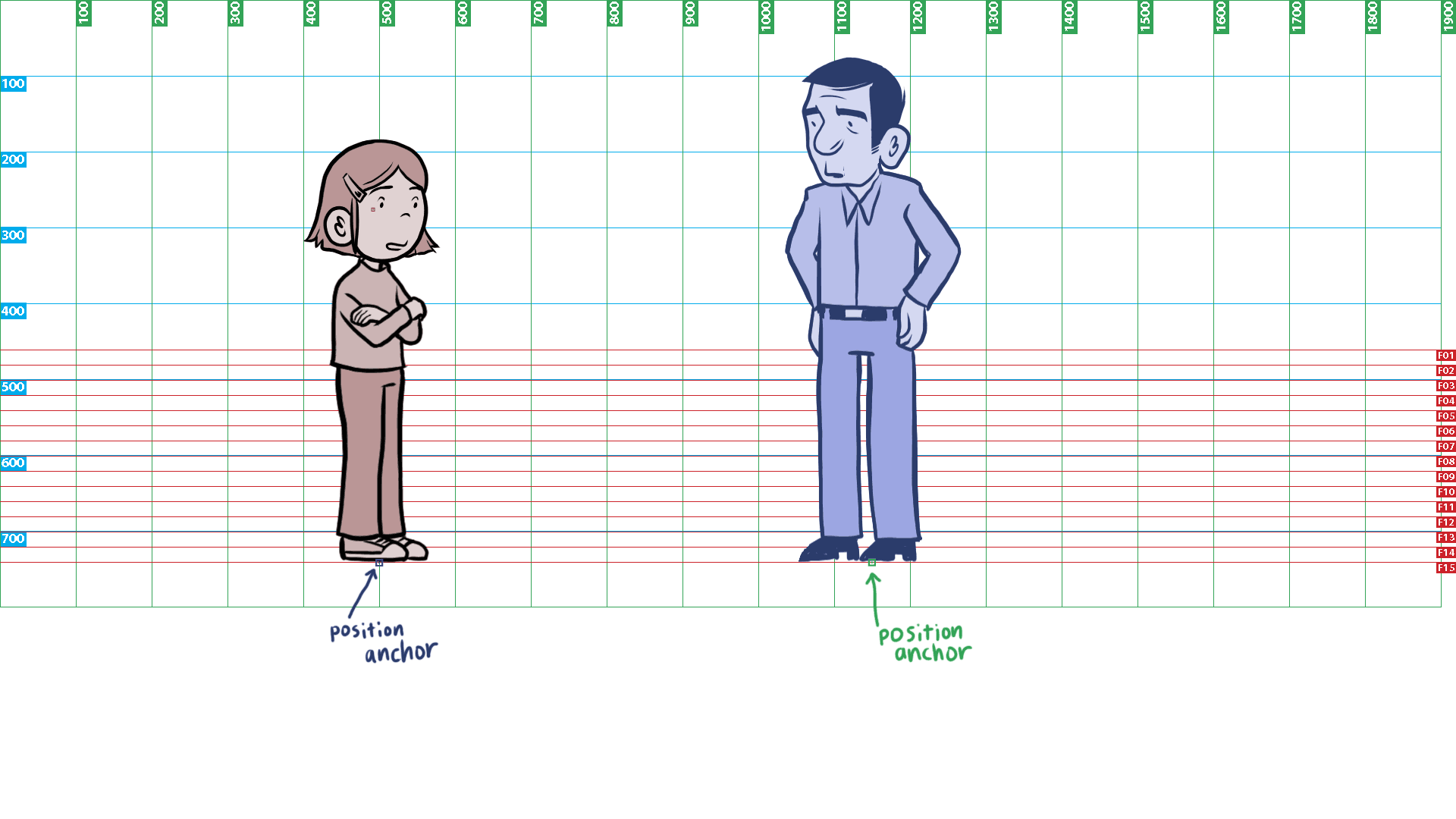
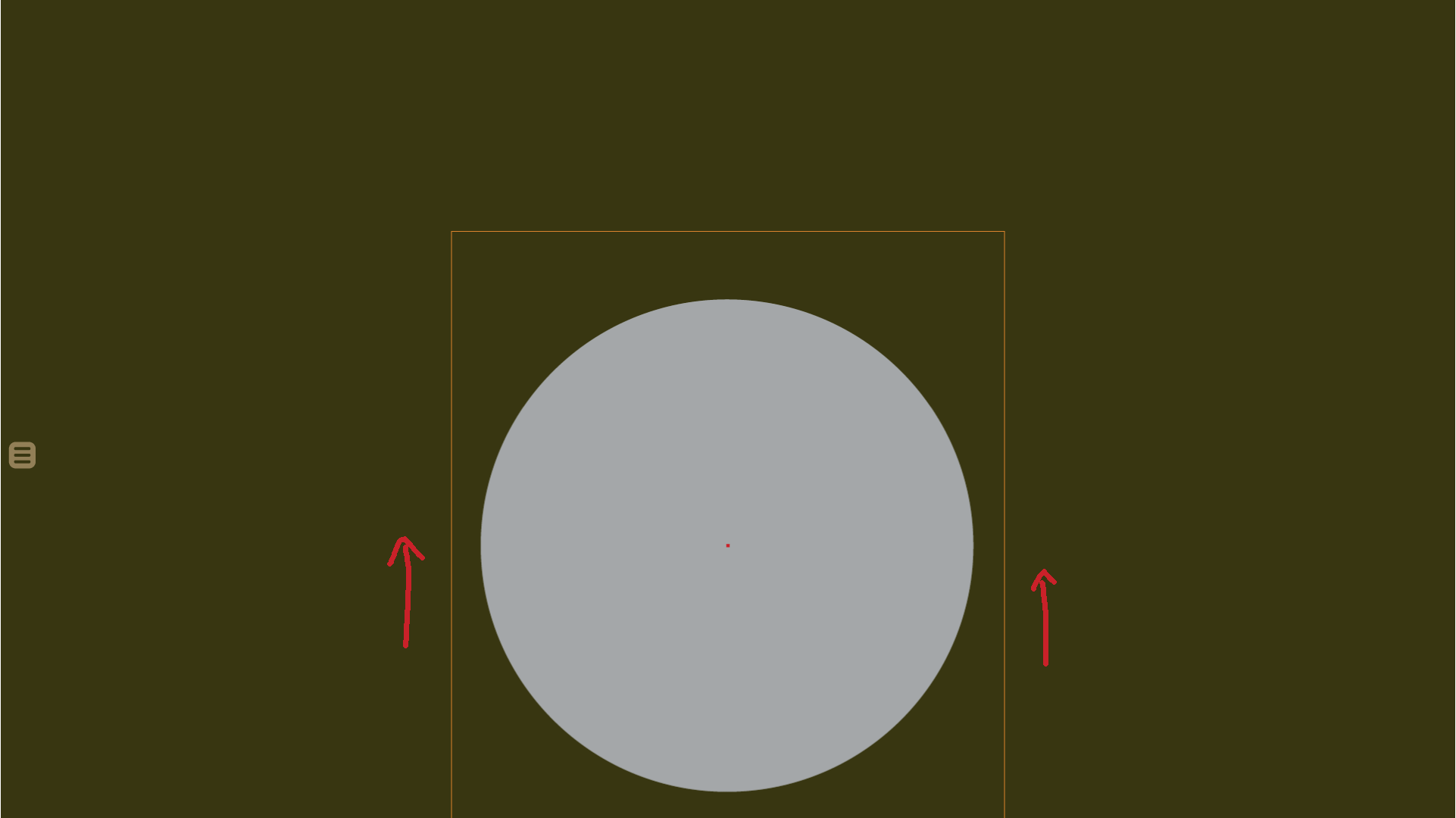
When [onFloor] is true, the [positionAnchor] should default to the bottom center of the sprite, where the sprite “touches” the floor: anchor=(0.5,1.0) . Ideally, I’d like to designate position on the stage using a custom method called [stagePos] which would work as follows:
x coordinate: designated in pixels.
y coordinate: denotes which [floorLine] the character is standing on.
The bottom one, [floorLine]=15, should be equivalent to ypos=741. Each decrement of [floorLine] should be 20px less. (So [floorLine]=14 is ypos=721, [floorLine]=13 is ypos=701, etc.)
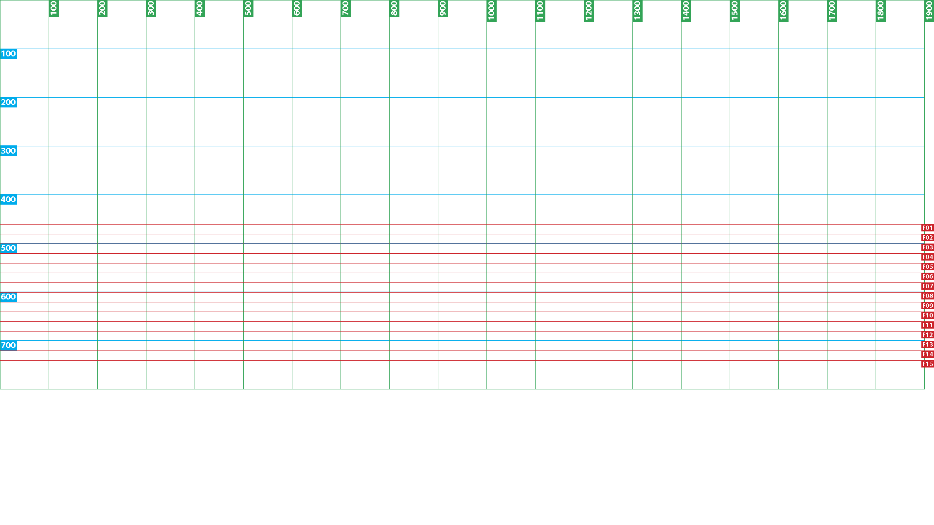 Above: Position grid. The red lines represent [floorLine] y positions.
I’d like to be able to further subdivide if need be (so [floorLine]=13.5 would be ypos=711). I don’t expect to use it much, but values of 0 or negative numbers should be possible too.
So for example, using [stagePos], a show declaration might look at this:
show girl at stagePos(200, 14.0)
The first number is the x value in pixels, the second number is [floorLine]=14 (or ypos=721).
If a third tuple for [stagePos] is provided, that should be used to set the zorder if it needs to be overwritten. Otherwise zorder should be calculated automatically, in the following way:
When [onFloor] is true, the zorder should automatically be determined based on the element’s y position, using ([floorLine]*10). So [floorLine]=15 would have zorder=150, [floorLine]=13.5 would have zorder=135, etc.
And finally, when [onFloor] is set to true, there should be a boolean [autoScale] property. For [stageChara], [autoScale] should default to true. For [props], [autoScale] should default to false. (It should also be possible to override [autoScale]’s value manually.)
When [autoScale] is true, [stagePos]’s y position value should effect scale.
[floorLine]=15 should be at 100% scale, and decrease by 3.45% per floor. (So [floorLine]=14, scale 96.55%. [floorLine]=13, scale 93.1%, etc.)
When [onFloor] is false
When [onFloor] is set to false, it denotes that the foreground element typically doesn’t touch the ground. Usually this will be used for contextual [props] like computers or plates; things that are placed on tables, desks and counters. But occasionally, [stageChara] themselves can have [onFloor] set to false (such as when they are lying on a bed).
When [onFloor] is set to false, the foreground element’s [positionAnchor] will default to the center of the sprite: anchor=(0.5, 0.5) . That position will be designated using standard xy coordinates.
When [onFloor] is set to false, their zorder can be set manually, or by designating if they are “on” something that has [onFloor] set to true. For example, if you had a “book on table”, then the book’s layer order would automatically set to the table’s layer +1.
One more thing about designating position: I don’t know if this is possible, but it’d be great if I could use [stagePos] to set the position of all foreground elements, regardless of their [onFloor] value. Like if the y value was an integer, (i.e. stagePos(200, 800)) it’d be evaluated as ypos. But if the y value was a float, (i.e. stagePos(200, 14.2))it’d evaluate y as a [floorLine] position. Another idea about automation: maybe the [onFloor] boolean could be set automatically based on whether the y value of [stagePos] is an integer or a float. I dunno, is that possible?
About [stageChara]
Every main character will have their own set of [stageChara] that can be swapped in and out of the scene when in [stageView]. [stageChara] are comprised on two main elements: [charaBody] and [charaHead].
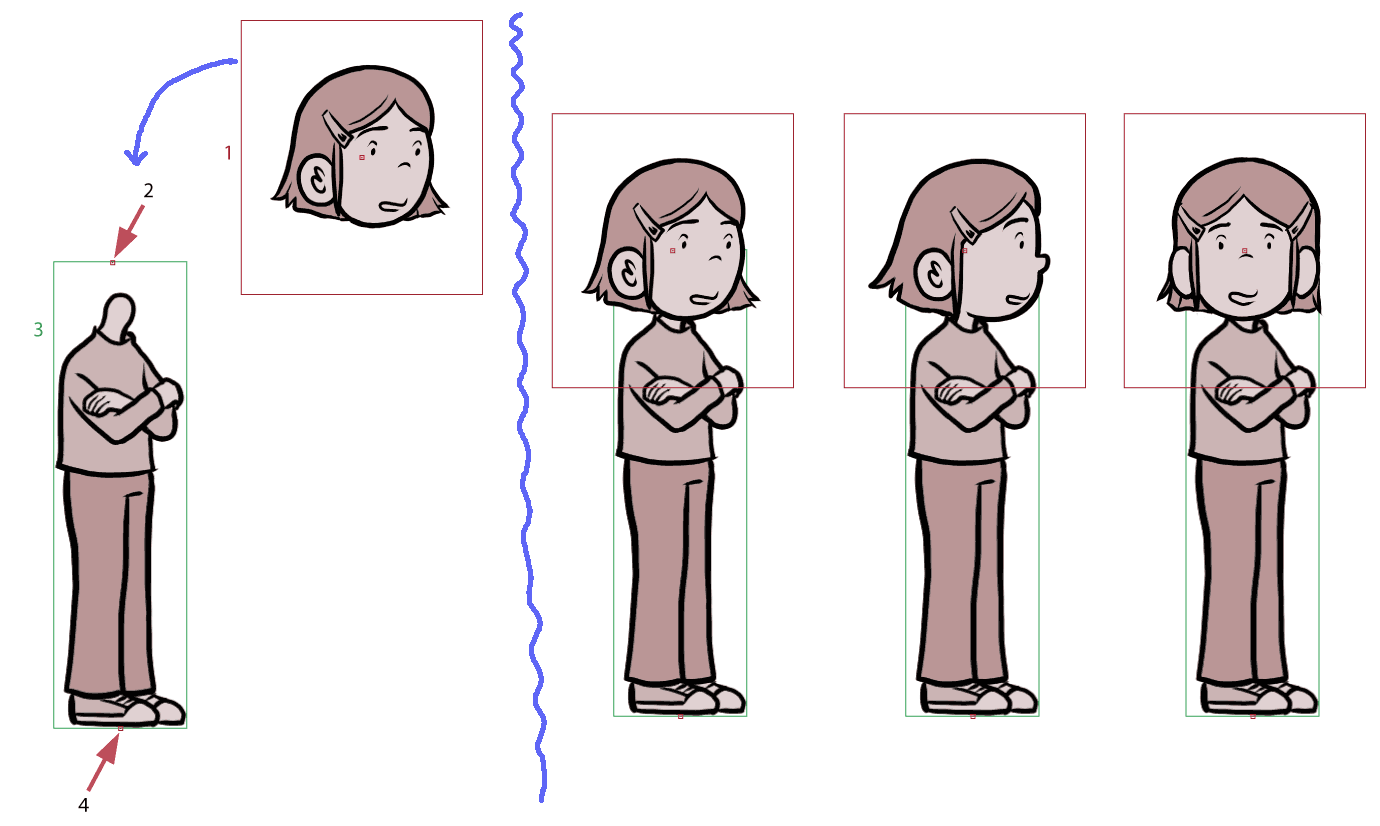 Above: Sample [stageChara] composition:
1) [3/4thFace] [charaHead], scaled down to 33%. Anchor point in the center of the cropped [charaHead] image.
2) [headAnchor] for [charaBody]. Described below.
3) [charaBody]. I’ll create a new image file for each pose.
4) [positionAnchor]. Should automatically set to the bottom center of [charaBody] (when [onFloor] is true).
To right of blue wiggly line: Assembled [stageChara], for [3/4thFace], [profileFace], and [frontFace]
About [charaBody]
[charaBody] is comprised of two elements, ordered from bottom to top:
1. [charaBodyColors] The greyscale “colors” that fill in the body. Should be set to the [accentColor] variation for that character. For example: define colorizeOdetteGrey = im.matrix.colorize(Color(Color(accentColor).interpolate((255,130,130), 0.13)).tint(0.9), accentColorWhite)
2. [charaBodyOutline] The lines that make up the outline of the body. Should be set to [contextualBlack].
The [positionAnchor] and [onFloor] boolean for each [stageChara] will be assigned to [charaBody]. In addition to those, each [charaBody] will have another anchor point called [headAnchor]. It will be used for positioning [charaHead]. [headAnchor] will also be used for determining the position of [speakLines], and for when a character needs to be spotlighted. There should also be a [headRotation] property (defaulted to 0). When the head is intended to be at an angle, the rotation property will be set to different values so that the [charaHead] will be correctly rotated.
[charaBody] should also have a [showHead] boolean defaulted to true. It can be set to false when a [charaHead] doesn’t need to be added (such as when I draw a custom head as a part of [charaBody] ).
About [charaHead] for [stageChara]
When the [showHead] boolean is true, a [charaHead] will be shown, scaled down to 33% of its original size and positioned at [headAnchor]. (If the [autoScale] property is true, it should be further scaled down accordingly.)
When [dialogue] is displayed in [stageView], [stageChara]’s [charaHead] should automatically update to the same expression as [sideImageChara]. When a character is talking, their [stageChara] should also have a brief [talkLines] animation appear from their head at [headAnchor]. (More about that in the “[talkLines] Animations for [stageChara] and [talkingHeadChara]s” section below.)
Character Placement Sample
 Above placement sample: Perhaps the Ren’py code might look something like this(?):
show odette 3/4th happy armscrossed at stagepos(500, 15.0)
show flipped dad 3/4ths normal handsonhips at stagepos(1150, 15.0)
My code probably isn’t formatted correctly, but here’s what I was trying to express:
The girl character Odette, with a [3/4thFace] [charaHead] with a happy expression, and an “arms crossed” [charaBody], is shown positioned at xpos=500 [floorLine]=15. (Based on the [positionAnchor] at the bottom center of her [charaBody].)
The Dad character, flipped horizontally, with a [3/4thFace] [charaHead] with a normal expression, and a “hands on hips” [charaBody] is shown at position xpos=1150, [floorLine]=15. (Based on the [positionAnchor] at the bottom center of his[charaBody].)
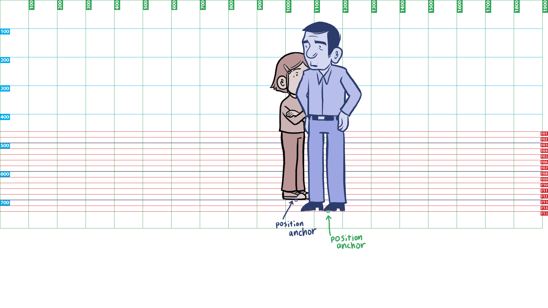 show odette at stagepos(1037, 13.0)
Assuming Odette started at the position shown in the first sample placement image, she moves to xpos=1037, [floorLine]=13. Since she would be further “back” in the “room” (based on her y position), her scale should automatically decrease to 93.1% (using the [autoScale] property), and her zorder of 130 would put her behind the Dad, whose zorder would be 150, based on the [floorLine]s they are standing on. Does that make sense…?
(More info on [stageChara] transitions below in “[stageChara] Animations” section.)
About [vignetteView]
[vignetteView] will be used to show other images and text outside of the main [stageView]. [vignetteView] will always have a [contextualBlack] background.
[vignetteView] is split into five subviews: [talkingHeadSubview], [montageSubview], [visualAidSubview], [intertitleSubview], and [timeChangeSubview].
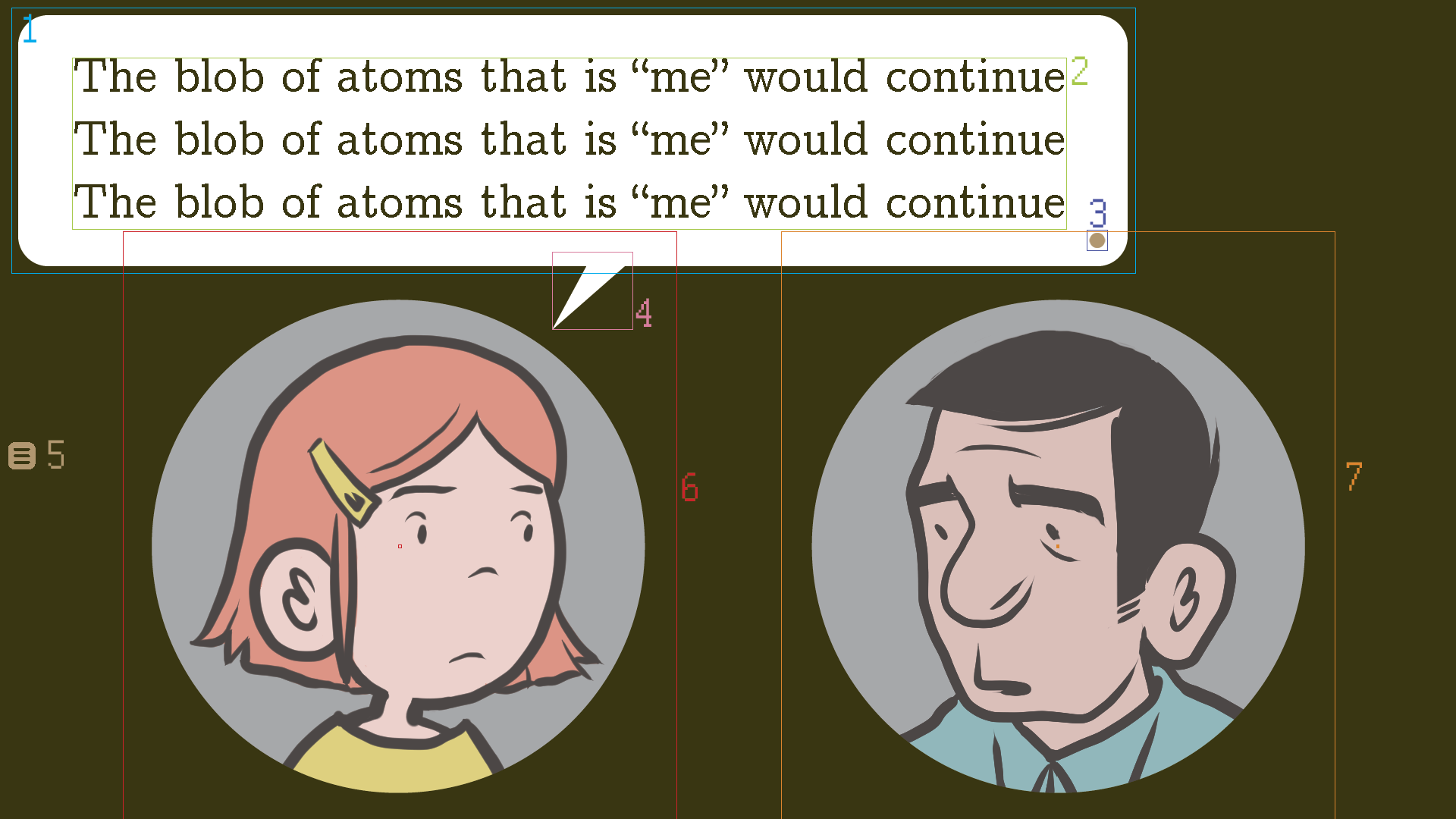
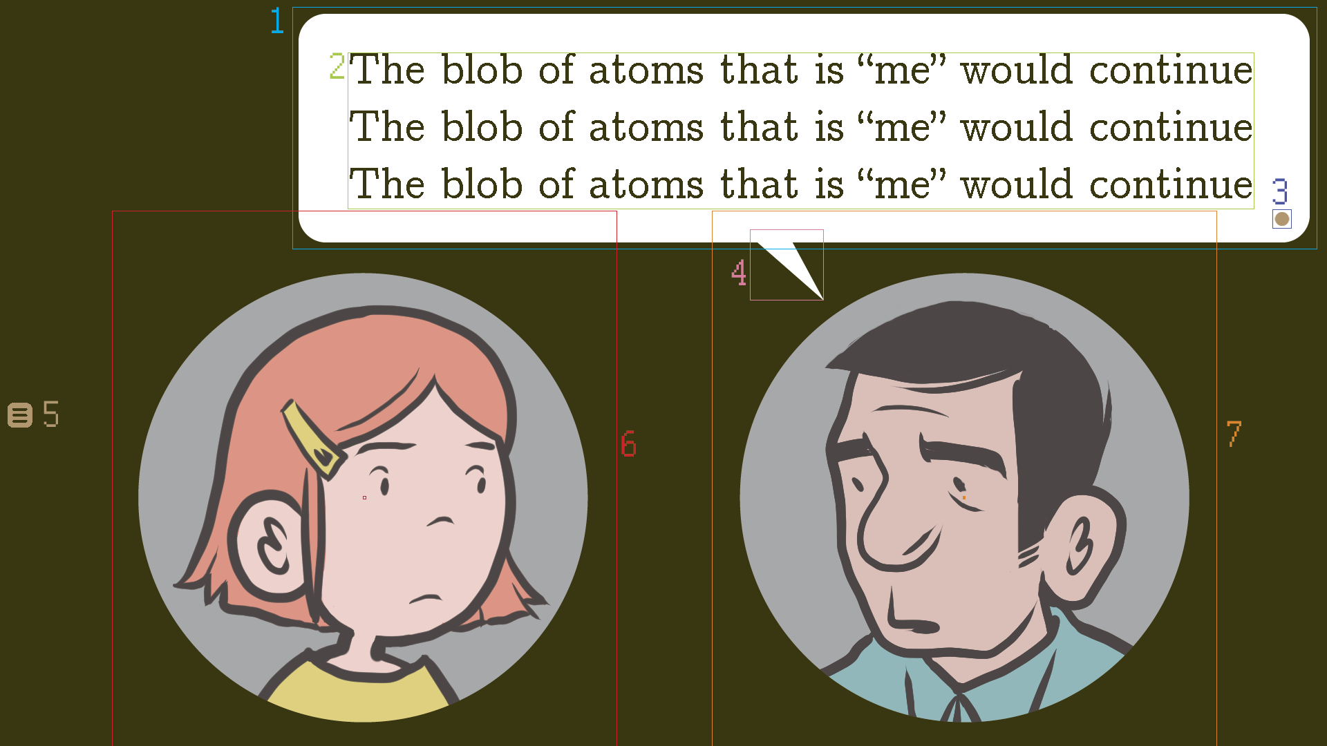
About [talkingHeadSubview]
This subview will be used for closeups of one or two characters. When text is [dialogue], it will be positioned as [topText]. When text is [narration] it will be positioned as [bottomText]. Each character in this view will displayed as [talkingHeadChara].
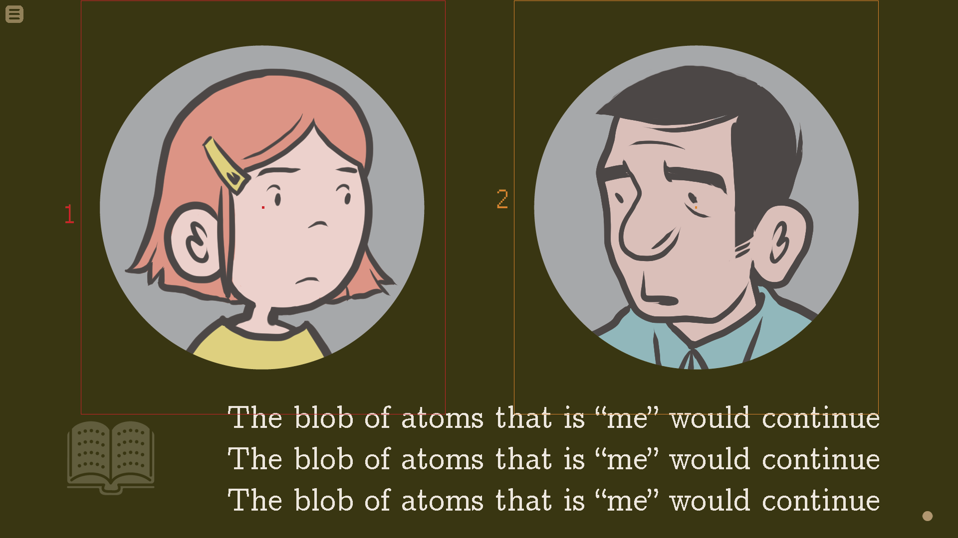
Above: [talkingHeadSubview] with [topText] [dialogue]. (More examples above in the “Text Position” section)
 Above: [talkingHeadSubview] with [bottomText] [narration]
About [talkingHeadChara]
Each [talkingHeadChara] will be made up of four parts. They are ordered here from bottom to top:
1) [smallCircleVignetteBottom] ( UIImages/smallcirclebottom.png ) The circle vignette the characters appear to be contained within. The bottommost layer. It’s not shown this way in the sample image, but it should be colored with im.matrix.colorize(contexualBlack, Color(accentColor).tint(0.4))
2) [charaShoulders]
3) [charaHead]
4) [smallCircleVignetteTop] ( UIImages/smallcircletop.png ) The topmost layer, used to hide the bottom part of [charaShoulders ]. It should be [contextualBlack].
By default, [charaHead] will be shown at [3/4thFace], and the character will be facing towards the center of the screen (or to to the right if the character is positioned in the center). The sprite can also be flipped horizontally so that the character appears to be facing in the other direction. I’d also like to be able to designate [charaHead] to [sideFace] or [frontFace] as well.
About [visualAidSubview]
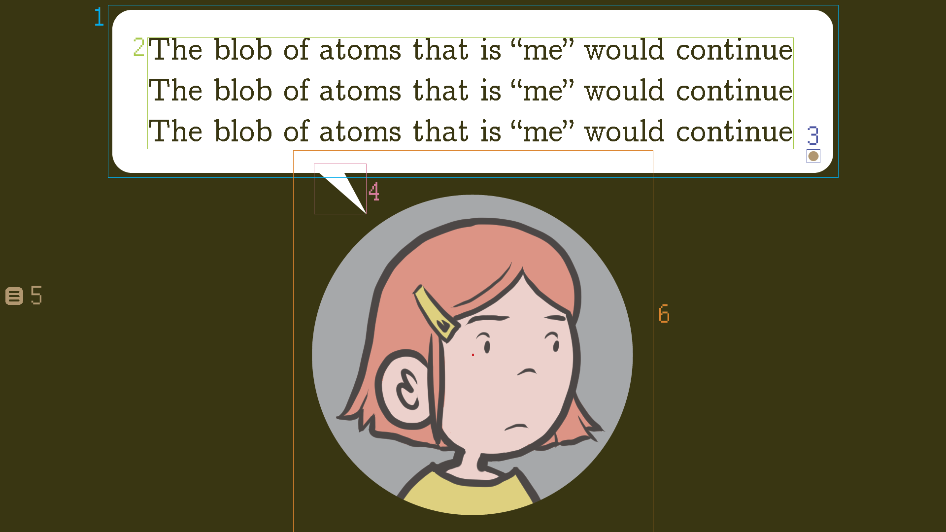
This subview will be used to show other images and text outside of [stageView] or [talkingHeadSubview]. Each image will be in its own small circle vignette. Text will always be positioned as [bottomText].
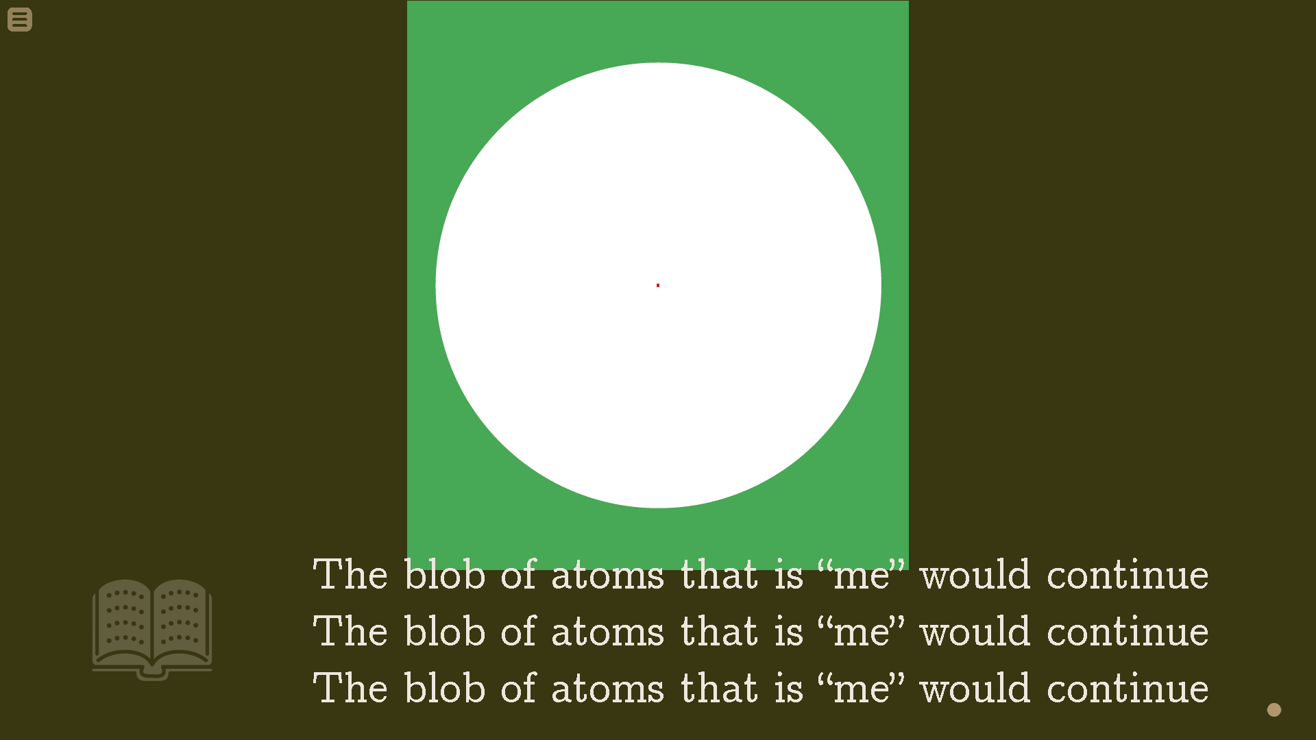 Above: [visualAidSubview] with [narration] [bottomText]. [smallCircleVignetteTop] is shown in green for clarity; it should actually be set to [contextualBlack].
The images in [visualAidSubview] will be made of three components, ordered from bottom to top:
1. [smallCircleVignetteBottom] ( UIImages/smallcirclebottom.png ) The bottom layer that displays before the visual aid pops into place. It’s not shown in the sample image, but it should be colored with im.matrix.colorize(contexualBlack, Color(accentColor).tint(0.4))
2. The actual visual aid image(s).
3. [smallCircleVignetteTop] ( UIImages/smallcircletop.png ) The topmost layer, used to crop the visual aid. It should be [contextualBlack].
About [montageSubview]
[montageSubview] is like [visualAidSubview], but is used for displaying a series of images with no text, sort of like a cutscene. Most of these “cutscenes” will be brief, usually just showing the “camera” panning across a series of still images. The reader clicks to advance to the next image in the montage.
The long montage images should be cropped so only the part inside the circle vignette can be seen.
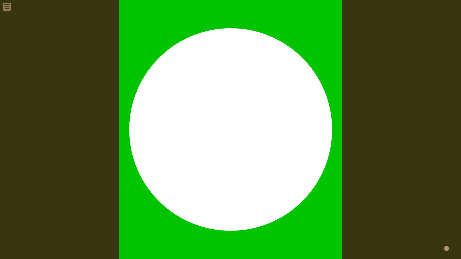 Above: [montageSubview]. [bigCircleVignetteTop] is shown in green for clarity; it should actually be set to [contextualBlack].
The images in [montageSubview] will be made of three components, ordered from bottom to top:
1. [bigCircleVignetteBottom] ( UIImages/bigcirclebottom.png ) The bottom layer that displays before the montage image pops into place. It’s not shown in the sample image, but it should be colored with im.matrix.colorize(contexualBlack, Color(accentColor).tint(0.4))
2. The montage image(s).
3. [bigCircleVignetteTop] ( UIImages/bigcircletop.png ) The topmost layer, used to crop the visual aid. It should be [contextualBlack].
About [intertitleSubview]
This subview will be used to show inter-titles, with text only. It will always be [middleText] [narration].
Above: [intertitleSubview]
About [timeChangeSubview]
Above: [timeChangeSubview], for time of day transitions
This subview is used to transition between different locations & times of day, and is also used to change the values of [contextualBlack] and [accentColor].
The frame graphic in the center is made up of tthree parts, ordered from bottom to top:
1) The correct sky image for the time of day. (Shown above as blue).
2) The frame that contains the sky. ( UIImages/skyframe.png ) Should be colored with: im.matrix.colorize(contexualBlack, accentColor)
3) Sun or Moon graphic at the correct rotation for the time of day.
(Details below in “Changing Scenes with [timeChangeSubview]” section.)
Transitioning from [stageView] to [vignetteView]
(Note: for brevity’s sake, I’ll only be describing transitions from [stageView] to [vignetteView]. Transitions to [stageView] from [vignetteView] will basically be the same thing, only in reverse.)
Transitioning from [stageView] to [vignetteView] will be done in two main steps:
Transition Step 1: A [contextualBlack] solid fills the screen, hiding the [stageView] stage
Transition Step 2: While step 1 is happening (or shortly after), unneeded UI elements will move off screen, and the necessary vignette elements will move into place.
Transition Step 1: Filling the screen with [contextualBlack]
Filling the screen with [contextualBlack] using slides
The default transition behavior should be a vertical slide, with the [contextualBlack] bar at the bottom of the screen zipping up to fill the to fill the entire screen. (Similar to “The Grandfather Paradox”: https://youtu.be/FX2DsZngAvo?t=4m53s )
Could also be designated to be a slideleft or slideright.
Filling the screen with [contextualBlack] using a circle iris wipe
Another way I’d like to be able to transition into [vignetteView] would be with a circle iris wipe. (Like in old Looney Tunes cartoons.) I have created a large circle image called [irisWipeCircle] ( UIImages/iriswipecircle.png ) for this purpose.
Default circle iris wipe transitions into all subviews EXCEPT [visualAidSubview]
When transitioning from [stageView] into all subviews except [visualAidSubview], the white (opaque) part of [irisWipeCircle] should show the [stageView], and the transparent part should show the [contextualBlack] solid that replaces it. The anchor point for [irisWipeCircle] should be its center: anchor=(0.5,0.5) .
[irisWipeCircle] begins at position (960, 378), starting with a scale of 55%. [irisWipeCircle] then shrinks to 0%, thereby causing the [contextualBlack] background to be completely shown.
I’d also like to be able to have [irisWipeCircle]’s center be positioned elsewhere on the screen. This starting position could be designated in pixels, or by having it center on an onstage [stageChara]’s [headAnchor].
If the [irisWipeCircle] anchor point is between 0px to 50px from either the left or the right edge of the screen, it should start at 100% scale. As described above, if [irisWipeCircle]’s xpos is 960px, [irisWipeCircle] should start at 55% scale. Xpos values in between the center and the left or right edges of the screen should effect the starting scale accordingly.
Default circle iris wipe transitions into [visualAidSubview]
When transitioning from [stageView] to [visualAidSubview], The white opaque part of [irisWipeCircle] should show the [stageView], and the transparent part should show the [visualAidSubview] that replaces it.
1) [irisWipeCircle] begins at position (960, 417) with a scale of 55%. [irisWipeCircle] shrinks to 16.9%.
2) While that is happening, the stage should begin to fade to a greyish color, using ( UIImages/visualaidallgrey.png colored with im.matrix.colorize(contexualBlack, Color(accentColor).tint(0.4)) ).
3) Once [irisCircleWipe] reaches the scale of 16.9%, it quickly dissolves out, being replaced by the [visualAidSubview] [circleVingnette] which quickly dissolves in to take its place. This should appear seamless to the viewer.
4) The appropriate visual aid image(s) should then move into place (in the manner below in the “Showing Images within [visualAidSubview] and [montageSubview]” section). Then the next text block should begin to display.
Transition Step 2: Moving unneeded [stageView] elements off screen, and having needed [vignetteView] elements appear
Transition Step 2 for [talkingHeadSubview] [topText] [dialogue]
1a) If only one character is moving into place, have [smallCircleVignetteBottom] and [smallCircleVignetteTop] (with no character inside) zip in from the bottom of the screen with a bounce.
1b) If two characters are moving into place, have [smallCircleVignetteBottom] and [smallCircleVignetteTop] (with no character inside) zip in from the left and right sides of the screen with a bounce.
2) At the same time, [bookWingding] and [ctcIcon] should slide off the bottom of the screen, and [menuHub] should move down from the top left corner.
 Above: The circle vignette without a character inside moves into place with a bounce, [bookWingding] and [ctcIcon] slide off bottom of screen, and [MenuHub] slides down.
3) Once the circle vignette(s) are in place, The character(s) (with their width squished to 70%) should quickly pop up from the bottom of the screen with a bounce. At the same time, the [topWordBubble] (with a “new” [ctcIcon] should be coming into view with a bounce. If there’s one character on screen, [topWordBubble] should be positioned in the center. If there are two characters, it should be above the first character to speak.
 4) When [talkingHeadChara] reaches the correct position, it should unwarp to 100% horizontal width, with a bounce. Then [topWordTail] should spring into place, and the text should begin to display.
Transition Step 2 for [talkingHeadSubview][bottomText] [narration]
Pretty much the same as above, only [bookWingding], [ctcIcon], and [menuNub] should stay put, and the circle vignette(s) should move in to their correct [bottomText] [narration] positions.
Transition Step 2 for [visualAidSubview]
If transitioning with circle iris wipe, follow above “Default circle iris wipe transitions into [visualAidSubview]” instructions.
Otherwise (after [contextualBlack] has filled the screen via Transition Step 1):
1) Have the small circle vignette zip into place from the bottom of the screen. [bookWingDing], [ctcIcon], and [menuNub] should stay put.
2) visual aid image(s) should start to display. (In the manner below in the “Showing Images within [visualAidSubview] and [montageSubview]” section)
Transition Step 2 for [MontageSubview]
1) [bookWingding] slides off bottom of screen. [ctcIcon] and [menuNub] should stay put.
2) The big circle vignette (with no image) should zip in from the bottom of the screen.
3) Montage image(s) should start to display. (In the manner below in the “Showing Images within [visualAidSubview] and [montageSubview]” section)
Transition Step 2 for [intertitleSubview]
1) [bookWingding] slides off bottom of screen. [ctcIcon] and [menuNub] should stay put.
2) [middleText] should begin to display in the center of the screen.
Transition Step 2 for [timeChangeSubview]
1) [bookWingding] slides off bottom of screen. [ctcIcon] and [menuNub] should stay put.
2) [timeChangeSubview] graphics/Text should fade in as described below.
Changing Scenes with [timeChangeSubview]
As stated above in the “About Display Views” section, [vingetteView] is usually used for brief asides, and then the view returns to the main [stageView]. So [stageView] background images and foreground images and their positions should persist (on a lower layer) even when the view temporarily switches to [vingetteView].
The exception to that is when [timeChangeSubview] is used. It is used exclusively for scene/time/location changes, and to change the values of [contextualBlack] and [accentColor].
As the name implies, [timeChangeSubview] signifies a change of time. The “times” used are:
[Day of the Week] Morning (e.g. “Monday Morning”)
[Day of the Week] At School
[Day of the Week] After School (or “[Day of the Week] Afternoon”)
[Day of the Week] Evening
[Day of the Week] Night
Sun or moon placement: As shown above in the red bounding box. The anchor point that rotation occurs at for the sun or noon is in the center of the red bounding box. anchor=(0.5, 0.5)
Transition animations are as follows:
Morning
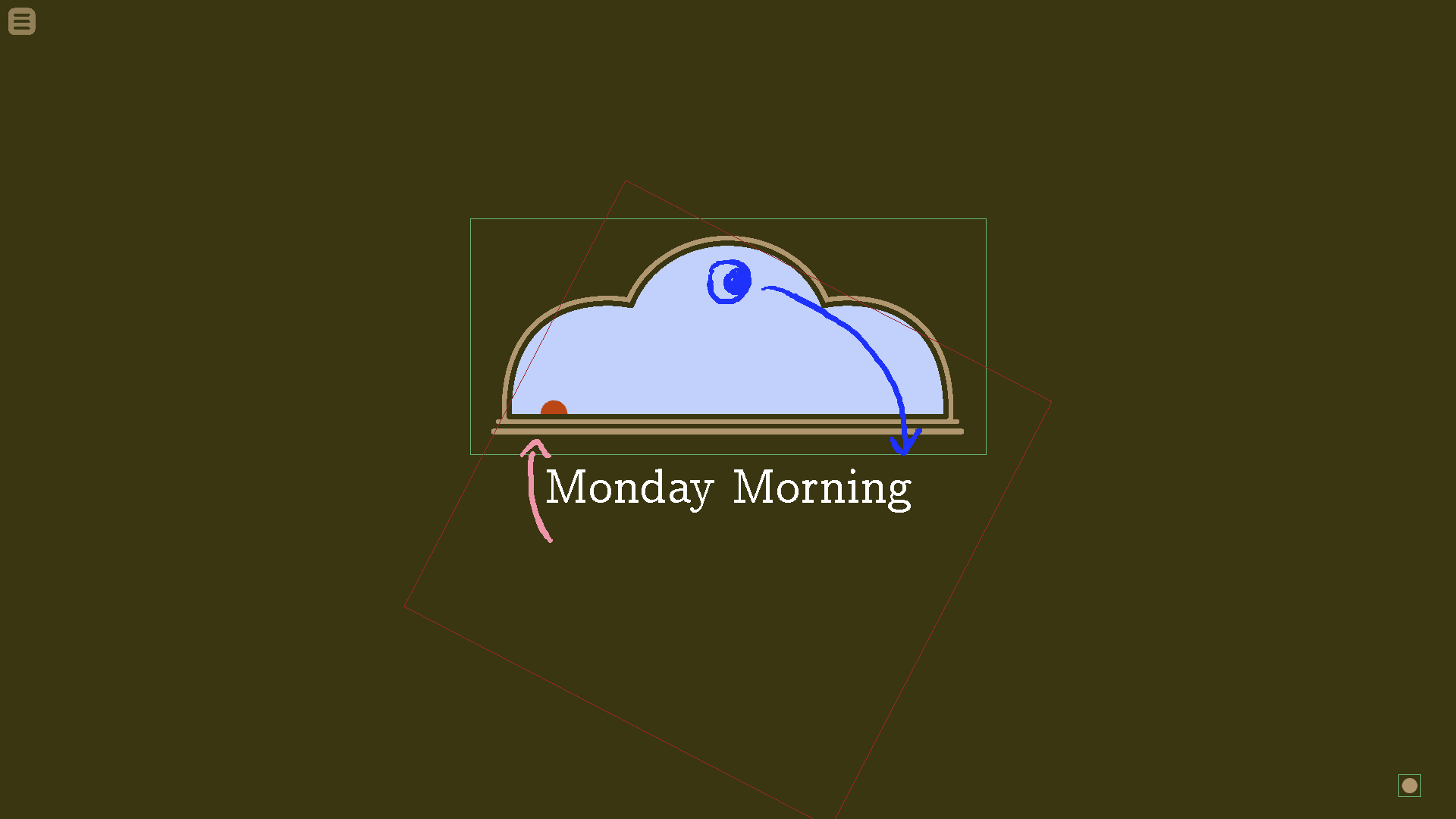
Animation for transitioning into “Morning”
1) [timeChangeSubview] fades in over 1.5 seconds, showing a night sky ( UIImages/sky_night.png ) with the moon ( UIImages/moon.png ) at 0° and a Sun ( UIIlmages/sun_riseset.png ) at 80° (i.e., the sun is completely out of view). The words “[Previous Day] Night” (So in the case of the above example, “Sunday Night”) should also be on screen.
2) 1 second pause.
Steps 3~6 happen simultaneously over 2 seconds:
3) Moon rotates out of frame to -80°
4) Sunrise Sun peeks out to a rotation of 62.5°
5) Old text fades out, new text saying “[Day of the Week] Morning” fades in.
6) Night sky dissolves into early morning sky ( UIImages/sky_earlymorning.png ).
7) [contextual Black] and [accentColor] fade into their new, designated values. So the “black” background should fade into the new value, as should the [accentColor] timeframe.
After all that happens, the [ctcIcon] “click to continue icon” changes to indicate it’s waiting for the reader to click to continue. When the reader clicks, everything fades out and the next scene begins at whatever location is designated.
At School
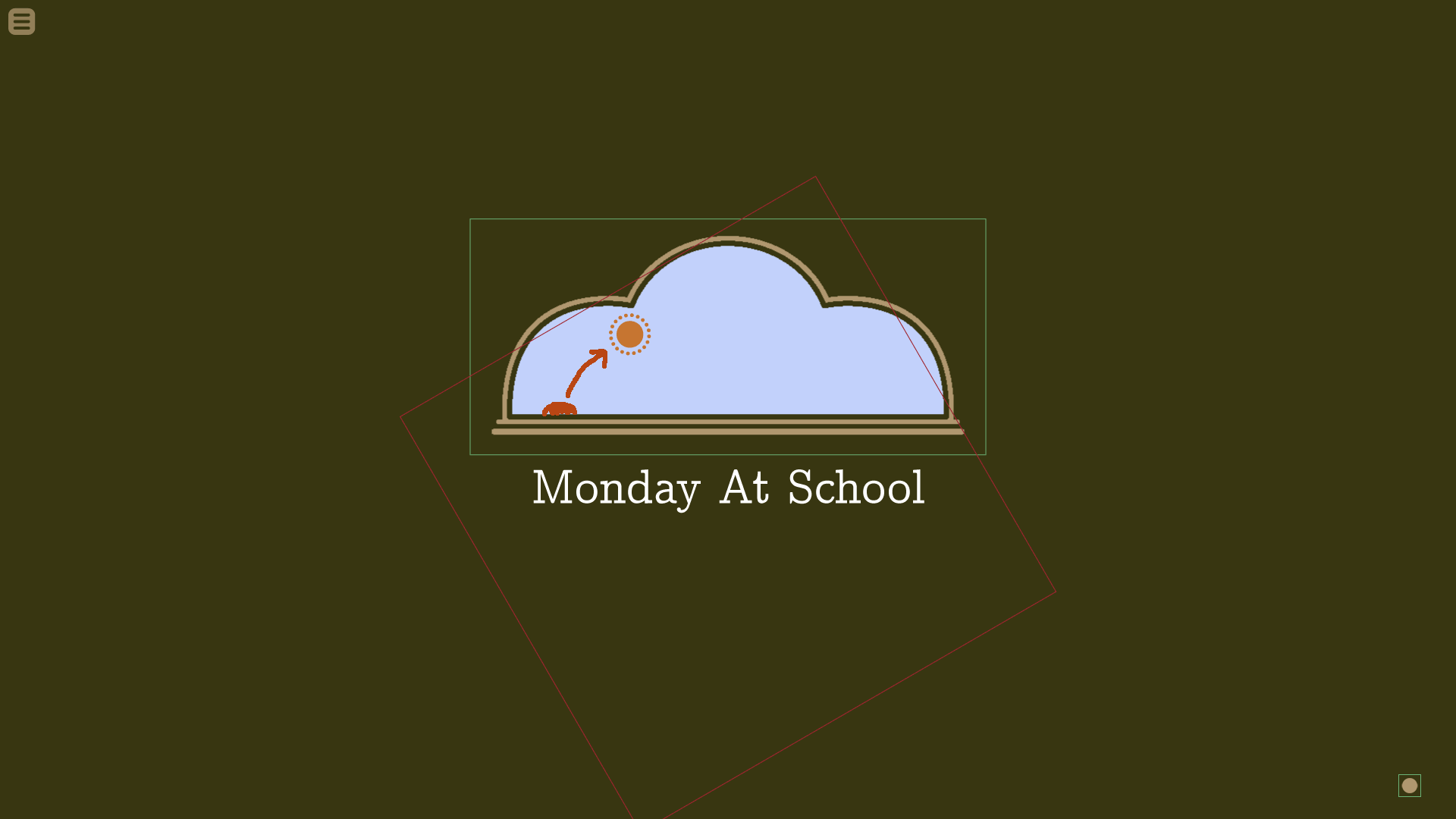
Animation for transitioning into “At School”
1) [timeChangeSubview] fades in over 1.5 seconds, showing an early morning sky ( UIImages/sky_earlymorning.png ) with the sunrise sun ( UIIlmages/sun_riseset.png ) at 62.5°, 100% opacity. Midmorning Sun ( UIIlmages/sun_midmorning ) also at 62.5°, only with 0% opacity. The words “[Day of the Week] Morning” should also be on screen.
2) 1 second pause.
Steps 3~7 happen simultaneously over 2 seconds:
3) Sunrise sun, along with midmorning sun, rotates to 30°
4) Sunrise sun fades to 0% opacity while midmorning sun fades to 100% opacity.
5) Old text fades out, new text saying “[Day of the Week] At School” fades in.
6) Early morning sky dissolves into into midmorning sky ( UIImages/sky_midmorning.png ).
7) [contextual Black] and [accentColor] fade into their new, designated values. So the “black” background should change slightly, as should the [accentColor] timeframe.
After all that happens, the [ctcIcon] “click to continue icon” changes to indicate it’s waiting for the reader to click to continue. When the reader clicks, everything fades out and the next scene begins at whatever location is designated.
After School / Afternoon
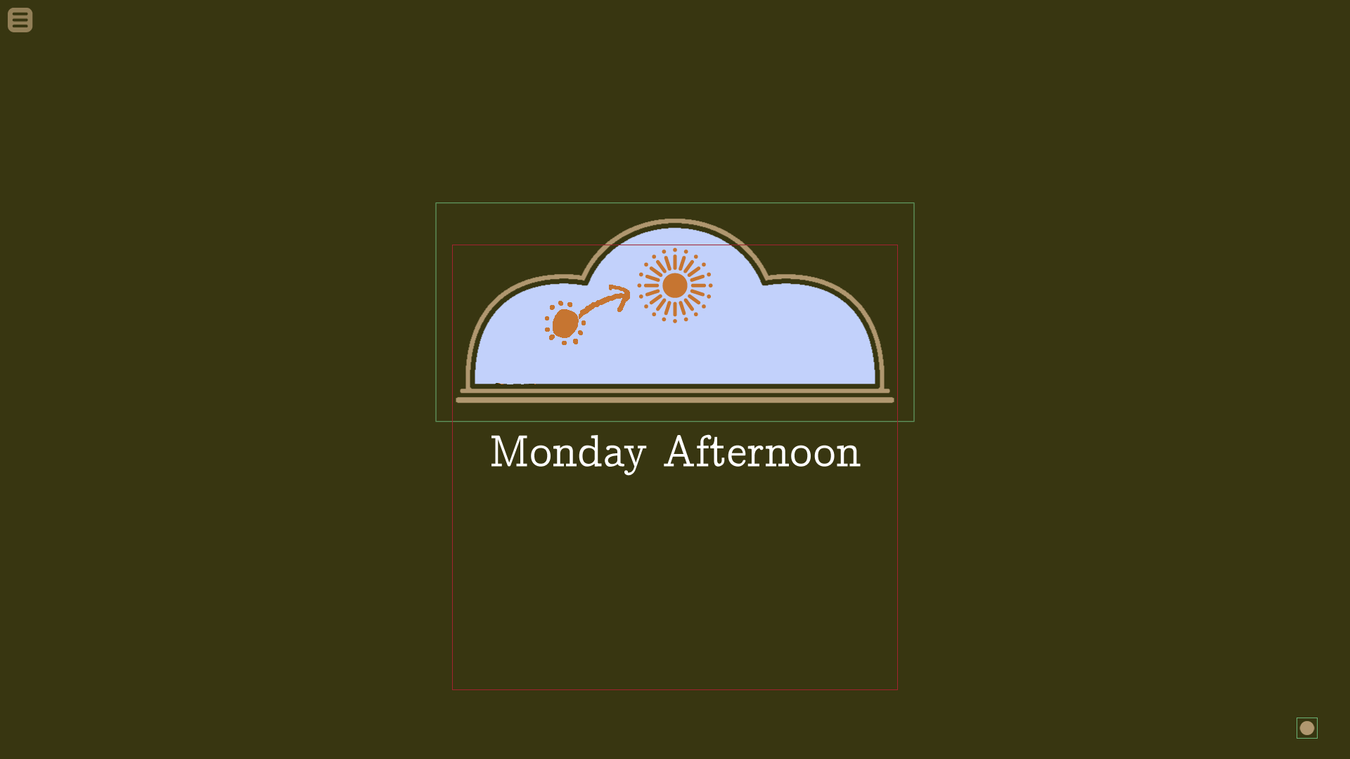
Animation for transitioning into “After School” and “Afternoon”
1) [timeChangeSubview] fades in over 1.5 seconds, showing a midmorning sky ( UIImages/sky_midmorning.png ). A midmorning sun ( UIIlmages/sun_midmorning.png ) should be at 30°, 100% opacity. Afternoon sun ( UIIlmages/sun_afternoon.png ) should also be at 30°, only with 0% opacity. The words “[Day of the Week] At School” should also be on screen.
2) 1 second pause.
Steps 3~7 happen simultaneously over 2 seconds:
3) Midmorning sun, along with afternoon sun, rotates to 0°
4) Midmorning sun fades to 0% opacity while afternoon sun fades to 100% opacity.
5) Old text fades out, new text saying “[Day of the Week] After School” (or “[Day of the Week] Afternoon”) fades in.
6) Midmorning sky dissolves into into afternoon sky ( UIImages/sky_afternoon.png ).
7) [contextual Black] and [accentColor] fade into their new, designated values. So the “black” background should change slightly, as should the [accentColor] timeframe.
After all that happens, the [ctcIcon] “click to continue icon” changes to indicate it’s waiting for the reader to click to continue. When the reader clicks, everything fades out and the next scene begins at whatever location is designated.
Evening
Animation for transitioning into “Evening”
1) [timeChangeSubview] fades in over 1.5 seconds, showing an afternoon sky ( UIImages/sky_afternoon.png ). The afternoon sun ( UIIlmages/sun_afternoon.png ) should be at 0°, 100% opacity. Midmorning sun ( UIIlmages/sun_midmorning.png ) and sunset sun ( UIIlmages/sun_riseset.png ) should also be at 0°, only with 0% opacity. The words “[Day of the Week] After School” should also be on screen.
2) 1 second pause.
Steps 3~8 happen simultaneously over 2 seconds:
3) Afternoon sun, along with midmorning sun and sunset sun, rotates to -62.5°
4) Over the course of one second, afternoon sun fades to 0% opacity while midmorning sun fades to 100% opacity.
5) After waiting one second for step 4) to happen, midmorning sun fades to 0% opacity while sunset sun fades to 100% opacity.
6) Old text fades out, new text saying “[Day of the Week] Evening” fades in.
7) Afternoon sky dissolves into into evening sky ( UIImages/sky_evening.png ).
8) [contextual Black] and [accentColor] fade into their new, designated values. So the “black” background should change slightly, as should the [accentColor] timeframe.
After all that happens, the [ctcIcon] “click to continue icon” changes to indicate it’s waiting for the reader to click to continue. When the reader clicks, everything fades out and the next scene begins at whatever location is designated.
Night
Animation for transitioning into “Night”
1) [timeChangeSubview] fades in over 1.5 seconds, showing an evening sky ( UIImages/sky_evening.png ). Sunset sun ( UIIlmages/sun_riseset.png ) should start rotated at -62.5°. and the moon ( UIImages/moon.png ) should be at 80° (i.e., the moon is completely out of view). The words “[Day of the Week] Evening” should also be on screen.
2) 1 second pause.
Steps 3~7 happen simultaneously over 2 seconds:
3) Sunset sun rotates to -80°, i.e. out of frame.
4) Moon rotates to 0°
5) Old text fades out, new text saying “[Day of the Week] Night” fades in.
6) Evening sky dissolves into into night sky ( UIImages/sky_night.png ).
7) [contextual Black] and [accentColor] fade into their new, designated values. So the “black” background should change slightly, as should the [accentColor] timeframe.
After all that happens, the [ctcIcon] “click to continue icon” changes to indicate it’s waiting for the reader to click to continue. When the reader clicks, everything fades out and the next scene begins at whatever location is designated.
Contextual Animations & Transformations
Animations & Transformations within [talkingHeadSubview]
Transition from [bottomText][narration] into [topText][dialogue] within [talkingHeadSubview]
1) [bookWingding] and [ctcIcon] slides down off bottom of screen.
2) Any onscreen [talkingHeadChara] slide down the their correct [topText] position.
3) [menuNub] slides down from the top left corner.
3) [topWordBalloon] slides in from the left, right, or top of the screen, depending of if the next talking character is on the left, right, or center, respectively. [topWordBalloon] should contain a “new” [ctcIcon]
4) [topWordTail] extends with a bounce, character begins talking with [talkLines] coming out of their head.
Transition from [dialogue] to [narration] in [talkingHeadSubview]
Pretty much the same as above, only in reverse.
[talkingHeadChara] [dialogue] transformations
Whenever a character talks in [talkingHeadSubview], the [topWordBalloon] should move over to be under the character, the [topWordTail] should move/flip to the correct position, and the character should bounce a bit, and a brief blinking [talkLines] animation should occur at their head. (More on [talkLines] below.)
Showing/hiding characters in [talkingHeadSubview]
As previously discussed, when only one character is on screen, they are in the center of a the screen. When a new character is added, with like show dad at right, then the center character would scooch over to the left. If a new character was added with show dad at left, the center character would scooch over to the right, and bounce/flip horizontal so that they are facing the center of the screen.
If there are two characters and one leaves, the remaining character moves to the center of the screen.
Since only two characters are allowed on screen at once, if a new character needs to be shown, the character they are replacing should pop out of their circle vignette, using the 70% horizontal scale change described above. The new character should enter the circle vignette in the same way. By default, the right side character will leave to make room for the new character, but the left side character can be made to leave instead by showing the new character with show (new Character) at left.
Showing Images within [visualAidSubview] and [montageSubview]
For images that don’t pan
When visual aid or montage images are perfect circles, they should rotate into the circle vignette, like in this scene in “The Grandfather Paradox”: https://youtu.be/FX2DsZngAvo?t=4m54s .
So the image should have its anchor point set to the bottom left corner. It’s should start off with a rotation of 90°, and rotate to 0°, into the circle vignette with a small bounce. All parts of the visual aid or montage images outside of the circle vignette should be cropped out. (Again, very similar to “The Grandfather Paradox”: https://youtu.be/FX2DsZngAvo?t=4m54s )
For images that need to pan
When a montage or a visual aid image isn’t a perfect circle, and instead is elongated, then they will need to pan vertically or horizontally.

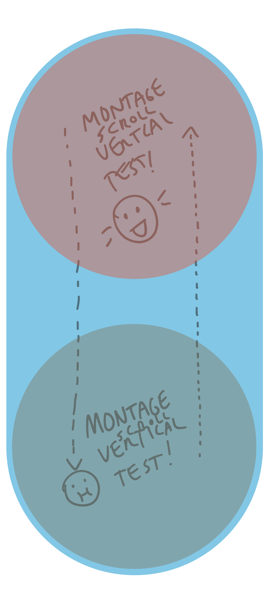 Above: Sample montage images ( montageimages/montagehorizontaltest.png ) and ( montageimages/montageverticaltest.png ) designed for testing panning. (In final game, could also be different lengths/heights).
It’d be nice to have custom methods could be called PanUp(), PanDown(), PanLeft(), and PanRight().
Just to make up some pseudo code, the show declaration might say something like:
show MontageImage at PanDown(3.0)
And it would work like this:
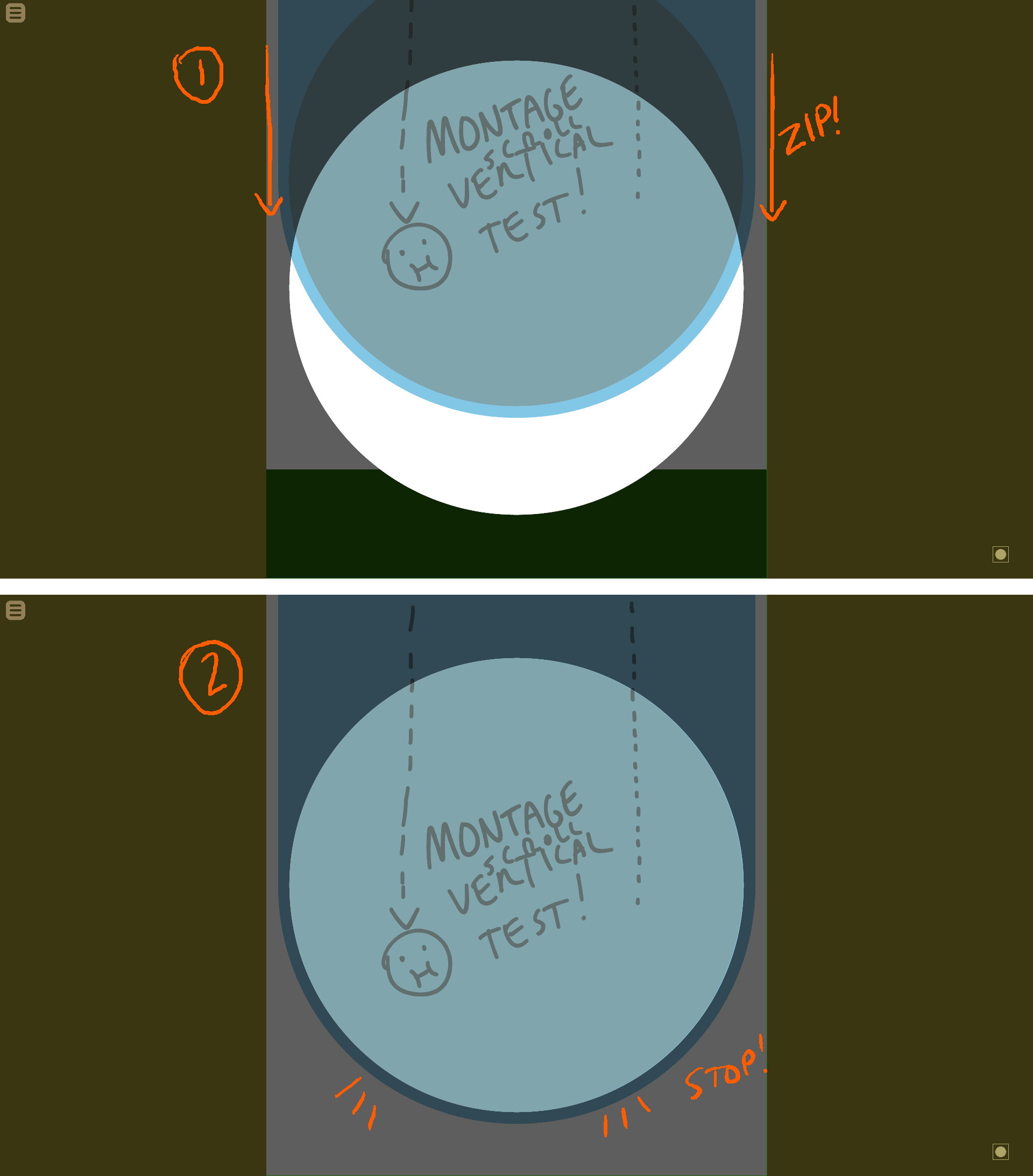 1) Since it’s using the method PanDown(), MontageImage should first quickly zoom in from the top, and…
2) …stop once it’s entered the circle vignette frame. (Circle vignette shown semi-transparent for clarity; in reality it would be opaque [contextualBlack].) There should be a 1 second pause before it begins to pan.
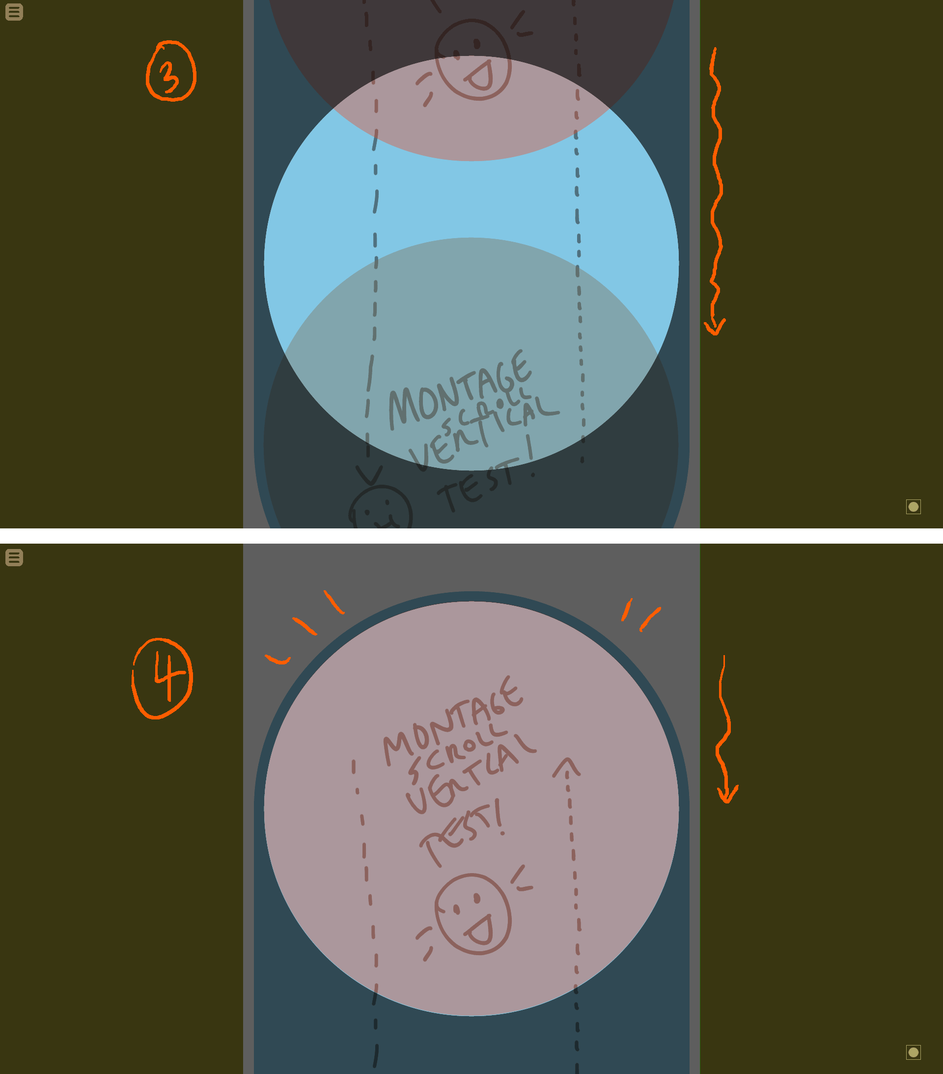
3) Then MontageImage should slowly pan down over the course of 3 seconds since I designated PanDown(3.0).
4) It should then stop at the top edge, and wait for the reader to click. I’d like to use EaseIn, EaseOut for the movement.
The above example was for PanDown(3.0). If I used a horizontal image and used PanRight(10.5), the image would quickly zip in from the left, stopping once it had entered the circle vignette. Then it would slowly pan to the right over 10.5 seconds, and stop once it reached the end of the image.
If the reader clicks while it’s in the middle of panning, it should immediately go to the end of the pan. And then it should wait for them to click again to advance.
[stageChara] Animations
[stageChara] bounce slightly, originating at [positionAnchor], in the following three cases:
1) When a [stageChara] enters or leaves a scene, or if they change position in the scene. This should also be accompanied with them fading in and/or out.
2) If the [stageChara]’s [charaHead] changes expression, or if its [charaBody] changes.
3) If the [stageChara] talks. This should be accompanied with [talkLines] animation being displayed, as well as the appropriate [sideImageChara] being displayed. (Info on [talkLines] below.)
***For examples of roughly how [stageChara] animation should should look, see how I handled it in my Unity test vn. If you watch about 30 seconds starting from here, it should give you a sense: https://youtu.be/FX2DsZngAvo?t=11m50s
[ctcIcon] (“Click To Continue” Icon) Animation
The [ctcIcon] will be made up of two layers, organized from bottom to top:
1) small CTC circle ( UIImages/ctc_dotsmall.png ). Color should be set to Color(accentcolor).tint(.5)
2) big CTC circle. ( UIImages/ctc_dot1.png ) ~ ( UIImages/ctc_dot5.png ). Color should be set as follows:
UIImages/ctc_dot1.png: a slightly saturated version of [accentColor] for (the same color used for [menuNub] Icon) UIImages/ctc_dot2.png~UIImages/ctc_dot5.png: Color(accentcolor).tint(.5)
When the vn is waiting for the reader to click to advance the text, the [ctcIcon] should show ( UIImages/ctc_dot1.png ).
While the game is in the middle of displaying text, or showing an animation/transformation, the CTC icon should quickly animate through ctc_dot2.png, ctc_dot3.png, and ctc_dot4.png, and then stop at ctc_dot5.png. ctc_dot5.png should then slowly rotate clockwise.
When the game finishes displaying text, or when the reader clicks to make all the text display instantly, then it should quickly cycle back through ctc_dot4.png, ctc_dot3.png, and ctc_dot2.png, and then stop back at ctc_dot1.png, when it will stay until the reader clicks again.
[talkLines] Animations for [stageChara] and [talkingHeadChara]
(For now, I’d like to just have one style of talk lines; it some point I might add more for different emotion types.)
Basically, talk lines should be used as they are used in The Grandfather Paradox, blinking twice and then disappearing whenever a character talks. They should only be used for [stageChara] and [talkingHeadChara], not [sideImageChara]. ([sideImageChara] will just bounce a bit when they talk.)
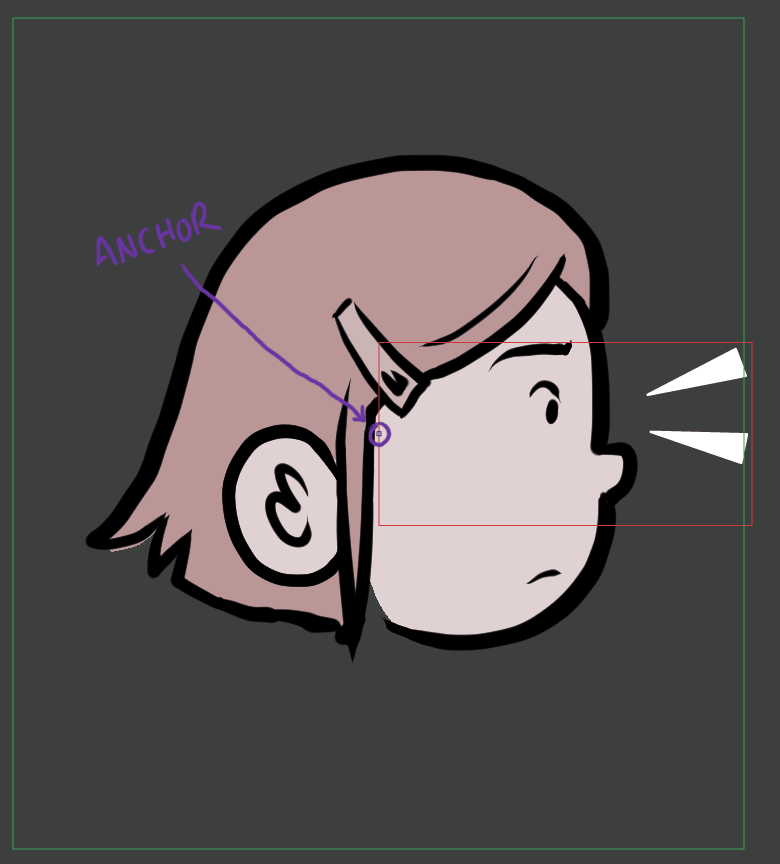
Above: Same [talkLines] placement.
Green box: The bounding box for [charaHead]. As always, the anchor point for [charaHead] is in the center of the cropped sprite. (Shown in purple). anchor=(0.5, 0.5)
Red box: The bounding box for [talkLines] ( UIImages/talklines.png ). The anchor point for [talkLines] should be flush with [talkLines]’s left side, centered vertically. anchor=(0.0, 0.5) It should then be positioned at [charaHead]’s anchor point.
[talkLines] should be scaled or flipped in the same way as [charaHead]. So if [charaHead] is scaled down to 33%, so should be [talkLines]. If [charaHead] is flipped horizontally, so should [talkLines] be.
[bottomText] Transitions
Transitioning from [narration] to [dialogue] for [bottomText]
All of this should happen fairly quickly:
1) The reader clicks, and the [narration] text disappears.
2) The bg box for [sideImageChara] (with no character inside) slides in from the left. It should appear that it “hits” [bookWingding].
3) Having been “hit” by [sideImageChara]’s bg box, [bookWingding] slides towards the right. while fading to 0% opacity. On the layer immediately below [bookWingding] should be a [bottomWordBubble], squished down to a size of (178, 148). I’ve represented it above as being semi-transparent green with a red border for clarity. The squished down [bottomWordBubble] should be moving to the right at the same speed as [bookWingding], so as [bookWingding] fades away, it should look like [bookWingding] is turning into the squished down [bottomWordBubble].
4) Once [bookWingding] has completely faded away, the squished down [bottomWordBubble] should begin to expand as it continues to move to the right. [sideImageChara]’s bg box should also be continuing to the right.
5) [sideImageChara]’s bg box should stop at it’s appropriate location with a small bounce. The left edge of [bottomWordBubble] reaches its correct left side position and stops there, while its top, bottom, and right sides continue to expand out.
6) [bottomWordBubble] expands to the correct size and stops with a small bounce. At the same time, [sideImageChara], with its horizontal side scaled down to 70%, pops in from the bottom of the screen.
7) [bottomWordTail] extends from [bottomWordBubble] with a bounce, the [sideImageChara] bounces a bit as well as it returns to 100% horizontal scale, and text begins to display.
Transitioning from [dialogue] to [narration] for [bottomText]
Again, this should happen fairly quickly. Pretty much the same as above, only in reverse.
1) [bottomWordTail] retracts back into [bottomWordBubble]
2) [bottomWordBubble] shrinks and moves to the left. [sideImageChara] exits the stage off the bottom of the screen, by first having its horizontal side scaled down to 70% and then leaving the screen.
3) Once [bottomWordBubble] shrinks to the size of [bookWingding], [bookWingding] should begin to fade in on top of it. (So it to appear that the squished down [bottomWordBubble] is turning into [bookWingding].)
4) Once [bookWingding] “hits” [sideImageChara]’s bg box, [sideImageChara]’s bg box should slide off screen to the left.
5) [bookWingding] returns to it’s original position, and text begins to display.
Transition for different speakers for [dialogue] [bottomText]
1) The currently speaking character should have their horizontal scale switch to 70%, and they should bounce off the bottom of the screen.
2) The new character, with a horizontal scale of 70%, should bounce up on screen, and then their horizontal scale should transition to 100% with a bounce and text should begin to display again.
Variables for [stageView] Foreground Images Sample Files
The following is in reference to the sample image files contained in this zip file: [ larsVNfiles.zip, file size 2.07MB ]
In the “About [stageView]” section, I defined some properties to be used for [stageView] foreground elements:
[onFloor] boolean
[autoScale] boolean
[showHead] boolean
[headAnchor] xy coordinates
[headRotation] rotation in degrees
[positionAnchor] (basically just what Ren’py calls “anchor”)
(Refer to “About [stageView]” section for more details)
The defaults for those properties is as follows:
[charaBody] property defaults
[showHead] = true
[onFloor] = true
[autoScale] = true
[headRotation]=0
[headAnchor]= anchor(0.5, 0.0) <<This will almost always be overwritten
[props] proptery defaults
[onFloor] = false
[autoScale] = false
Defaults for all [stageView] foreground elements when [onFloor]=true
[positionAnchor]= anchor(0.5, 1.0)
zorder based on image’s ypos (see “When [onFloor] is true” section)
Defaults for all [stageView] foreground elements when [onFloor]=false
[positionAnchor]= anchor(0.5, 0.5)
zorder=0
Below are the variables for those custom properties for the image files included in the zip file. I’ve only included values when they differ from the above listed defaults. For brevity I’ve just designated the foreground elements based on their black lines png files; all foreground images have a color component as well. (e.g., chara/odette/charabody/b_od_armscrossed_lines.png is paired with chara/odette/charabody/b_od_armscrossed_colors.png )
[charaBody] Image Variables
chara/odette/charabody/b_od_armscrossed_lines.png
[headAnchor]= (58, 0)
chara/odette/charabody/b_od_sittingnohead_lines.png
[headAnchor]=(66, 0)
[autoScale]=false
chara/odette/charabody/b_od_sittinghead_lines.png
[showHead]=false
[autoScale]=false
[headAnchor]= (105, 100)
chara/dad/charabody/b_da_handsonhips_lines.png
[headAnchor]=(134, 0)
[props] Images
bg/kitchen/table-lines.png
[onFloor]=true
[autoScale]=false
[positionAnchor]= anchor(0.0, 1.0)
[stagePos] = (0, 14.0) i.e., (xpos=0, ypos=721)
bg/kitchen/chair1-lines.png
[onFloor]=true
[autoScale]=false
[positionAnchor]= anchor(0.0, 1.0)
[stagePos] = (0, 15.0) i.e., (xpos=0, ypos=741)
bg/kitchen/chair1cushion-lines.png
[onFloor]=true
[autoScale]=false
[positionAnchor]= anchor(0.0, 1.0)
[stagePos] = (0, 14.0, 148) i.e., (xpos=0, ypos=741) zorder=148
bg/kitchen/chair2-lines.png
[onFloor]=true
[autoScale]=false
[positionAnchor]= anchor(0.0, 1.0)
[stagePos] = (0, 13.1) i.e., (xpos=0, ypos=703)
Missing Stuff
This doc hasn’t at all discussed music/sound, or what the menu screen looks like.
I’d like to incorporate music and sound, perhaps sometimes having SFX accompany animation or have character talking “beeps”, like in Professor Layton games. I’d also like to have simple custom menus to match the look and feel of this visual novel.
I don’t expect either of those things to be particularly ambitious or unusual in terms of programming, but just wanted to mention their absence and say I would be looking for help implementing them. But I think I’ve described most of the unconventional, possibly challenging programming stuff above.
Conclusion
Okay! I think that pretty much covers it. I did my best to clearly describe everything, but I’m sure there are important details I’ve forgotten to write about (or haven’t even considered). Or maybe I’ve gone into too much detail… Anyway, please get in touch if you have any questions. Thanks for taking the time to muddle through this!