Immortal Mountain Fairy

1511053_10152360322023913_6136997578168569964_n
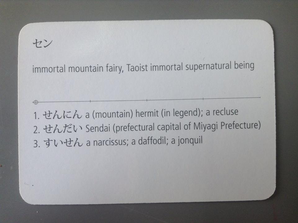
I’m currently studying for the highest level of the Japanese Language Proficiency Test. The test is intended for non-native speakers, so even though it’s the “highest” level, you really only need the reading comprehension of a typical Japanese high school grad to pass, and most of the vocab and kanji seem pretty practical.

That said, it’s sort of hard to not feel like I’m scraping the bottom of the barrel of when I’m studying the kanji for “immortal mountain fairy”. Oh well, at least it will come in handy for all the Japanese language “Twilight” knockoffs I’m intending to write!

The Soy Song

I’ve lived in Japan off-and-on for a total of eight years now. At this point I’m pretty desensitized to weird Engrish and wacky Japanese tv shows and such, so I rarely find them amusing like I did when I first got here.

But once in a blue moon, something comes along that’s bizarre in just the right way to really tickle me. The Soy Song is a prime example.

One of my elementary schools inexplicably decided to have English lessons centered around beans. The above song was the centerpiece of the lesson. It was one of the few times in class that I’ve had to fight with all my might to stifle my laughter.

Here’s what they’re singing in case you can’t make them out:
1504044_10152320588943913_1187962522_n

Source: https://www.kenko-hyogo21.jp/daizu.html

I Like Nathan Fielder.


Direct YouTube Link

I’ve been trying to keep the weekly updates to this blog “on topic” (that topic of course being ME, ME, ME!!), but last week was busy and exhausting so I didn’t really have time to write anything.

So this week’s blog entry is a few links to YouTube videos featuring Nathan Fielder. The above clip is from his current show Nathan For You. It’s essentially a prank show, only funnier and less mean-spirited than the typical fare.

The second season of Nathan For You premieres on Comedy Central on July 1st. Check it! And if you enjoyed the above clip, here are a few segments Fielder did for the CBC’s This Hour Has 22 Minutes:

Continue reading I Like Nathan Fielder.

Genuine Imitations

proofcloseupPictured: Tonoharu: Part One Proof Detail

Until the latter half of the twentieth century, most books were printed on a letterpress. Rows of raised metal letters were arranged on a block, inked, and then pressed into the paper. The pressure required to transfer the ink created an indentations on the printed page. Master printers strived to have the letterpress “kiss the paper”; to use only as much pressure as was strictly necessary to transfer the ink, leaving the paper as smooth and indentation-free as possible.

These days, laypeople reproduce documents on photocopies and laser printers, and most books are printed using offset lithography. These technologies leave no indentations on the page at all, and are considerably cheaper, easier, and more versatile than a letterpress.

So when letterpress printing is employed now, it’s for aesthetic rather than practical reasons. The designer wishes to evoke a traditional/classic feel that letterpress printing imbues. And the main characteristic that distinguishes letterpress printing from modern methods is the indentations.

So rather than try to eliminate them, modern letterpress printers try to make the indentations as obvious as possible. They use durable, thick paper stocks, and apply as much pressure as they can to really dig those letters in. What was once a defect has become a feature.

These thoughts occurred to me as I was preparing files for the forthcoming Tonoharu: Part One paperback. The hardcover editions Tonoharu were printed on cream-colored paper stock, but I’ve since learned there’s a more cost effective way to get a similar effect. It’s actually cheaper to print on the interior pages on standard white paper, and then coat the page with cream-colored ink to simulate cream paper stock.

At first blush this seems completely counterintuitive. Can you imagine trying to save money by doing this on an ink jet printer? But commercial printers play by a different set of rules. And if makes sense when you think about it. Mixing inks is a lot easier and cheaper than making colored paper from scratch, so rather than having small qualities of a million different colored papers, they can just buy white paper in bulk and custom mix ink to whatever hue their customers want.

The simulated cream paper is cheaper than actual cream paper, but it’s not free of course. Giving the pages of Tonoharu the cream treatment added about 10% to my production costs.

So basically, I’m paying a premium to make the pages of Tonoharu look like they’ve been yellowed with age; to give them a more “natural” feel than the artificial, bleached white paper. It’s kind of ironic, right? I’m taking great pains to obscure the actual paper stock in order to foster the appearance of authenticity. I thought that was kind of funny.

A Matter of Scale: “Tonoharu: Part One” Paperback Design Notes

tono1thumbsPictured: Images of Tonoharu’s covers at a fraction of their actual size.

The new paperback edition of Tonoharu: Part One sports a completely redesigned cover. One of the main reasons for the overhaul was to fix an issue I had with the original design.

I designed the hardcover in early 2007, so more than seven years ago (wow). This was before the iPhone and Kindle were introduced. MySpace was still the leading social network. I was still in the demographic that marketers care about (ah, 18-34 year olds, how I miss your privileged company).

But in terms of design considerations, the most significant difference is this: in 2007, the vast majority of books were purchased from brick-and-mortar stores, whereas now most are purchased online.

The original Tonoharu hardcover was designed to evoke ordinate nineteenth century etchings. Its strength lies in all the neat little microscopic details waiting to be discovered and lost in. Its weakness is that it’s static and symmetrical, and composed entirely of washed out colors. It lacks dynamism and doesn’t really “pop”.

In short, it’s a design that only works if you can inspect an actual physical copy of the book before you buy it.

Even in 2007, this was less than ideal. But now, most buyers don’t see the actual cover until a book is shipped to them. Prior to that, all they ever see is a “thumbnail” (a postage stamp-sized reproduction) on a computer screen.

The thumbnail presentation obliterates Tonoharu’s hardcover’s one strength. At this reduced size, all of the fancy details turn into mud, leaving just a tombstone-shaped blob.

tonocompare
Pictured: 
Tonoharu: Part One detail compared to Amazon.com thumbnail (Click to Enlarge)

So with the new design, I wanted something that would still have a presence even when displayed at a fraction of its actual size. I went with bright primary colors, a san-serif font, and an art-deco inspired design. I also cut down on the ornamentation to give it a more streamlined look.

At the same time I didn’t want it to be too sparse, so I created an intricate background pattern that weaves into the dotted lines that run through the design.

But for all the changes, the new design does harken back to the original design. I brought back the sun motif and illustrations from the hardcover, and used the same serif font for the back cover.

Being a perfectionist, I could tweak the design forever, but for the most part I’m pretty happy with how it turned out. I think it strikes the right balance between reducing well and still having some neat details.

I’m curious, dear readers, which version of the cover do you prefer?

“Tonoharu: Part One” Paperback Proofs!

I got the proofs for the paperback of Tonoharu: Part One from my book printer last week. Click here to take a look:

https://www.facebook.com/media/set/?set=a.10152428665058913.1073741827.594318912&type=1&l=a382296cd4

There are a few small nitpicky things I’d like to see fixed, but for the most part I’m really happy with how they turned out.

I’ve sent my notes back to them, and expect they’ll start producing the books in June sometime. Exciting!