Genuine Imitations

proofcloseup
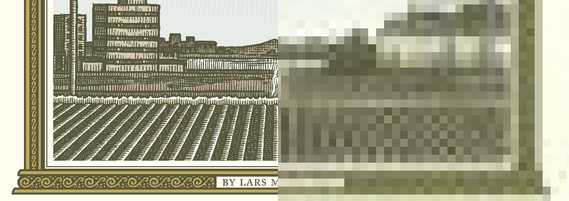
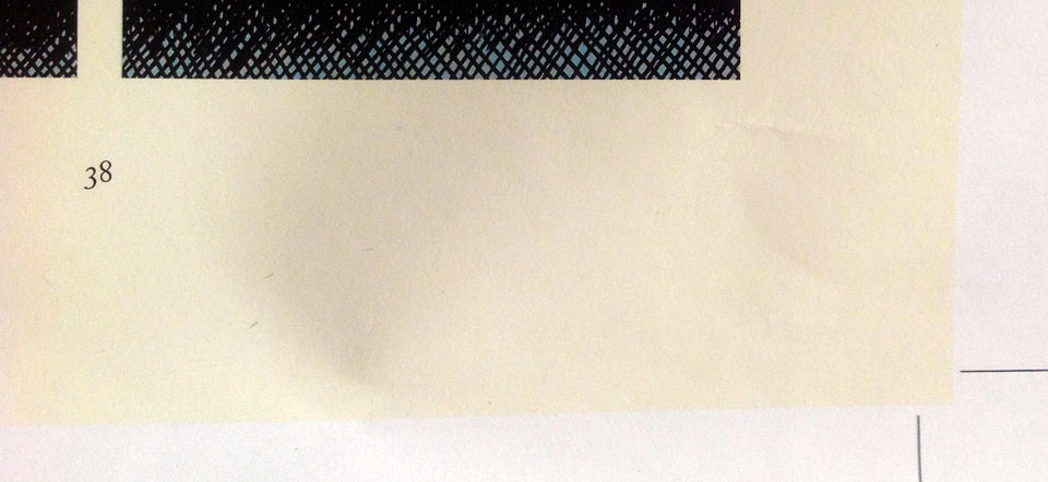
Pictured: Tonoharu: Part One Proof Detail

Until the latter half of the twentieth century, most books were printed on a letterpress. Rows of raised metal letters were arranged on a block, inked, and then pressed into the paper. The pressure required to transfer the ink created an indentations on the printed page. Master printers strived to have the letterpress “kiss the paper”; to use only as much pressure as was strictly necessary to transfer the ink, leaving the paper as smooth and indentation-free as possible.

These days, laypeople reproduce documents on photocopies and laser printers, and most books are printed using offset lithography. These technologies leave no indentations on the page at all, and are considerably cheaper, easier, and more versatile than a letterpress.

So when letterpress printing is employed now, it’s for aesthetic rather than practical reasons. The designer wishes to evoke a traditional/classic feel that letterpress printing imbues. And the main characteristic that distinguishes letterpress printing from modern methods is the indentations.

So rather than try to eliminate them, modern letterpress printers try to make the indentations as obvious as possible. They use durable, thick paper stocks, and apply as much pressure as they can to really dig those letters in. What was once a defect has become a feature.

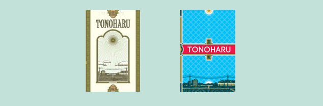
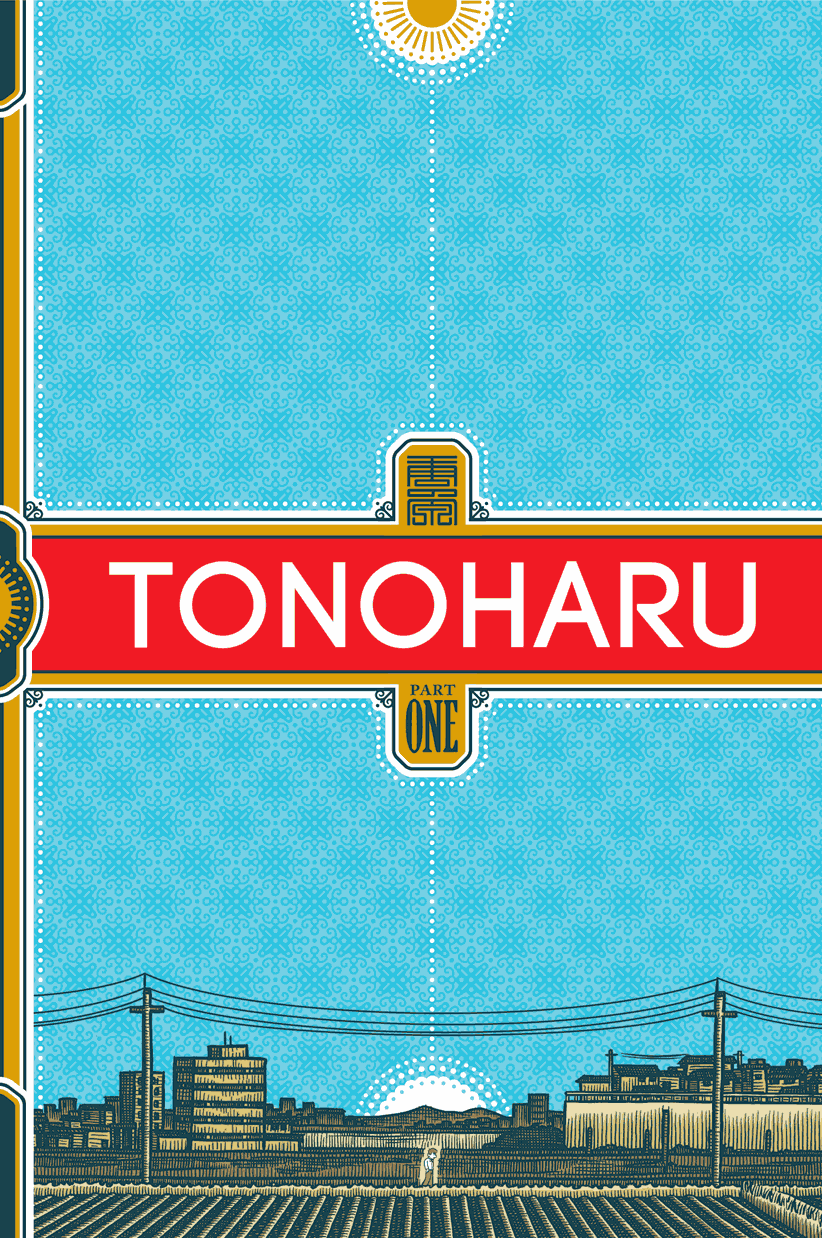
These thoughts occurred to me as I was preparing files for the forthcoming Tonoharu: Part One paperback. The hardcover editions Tonoharu were printed on cream-colored paper stock, but I’ve since learned there’s a more cost effective way to get a similar effect. It’s actually cheaper to print on the interior pages on standard white paper, and then coat the page with cream-colored ink to simulate cream paper stock.

At first blush this seems completely counterintuitive. Can you imagine trying to save money by doing this on an ink jet printer? But commercial printers play by a different set of rules. And if makes sense when you think about it. Mixing inks is a lot easier and cheaper than making colored paper from scratch, so rather than having small qualities of a million different colored papers, they can just buy white paper in bulk and custom mix ink to whatever hue their customers want.

The simulated cream paper is cheaper than actual cream paper, but it’s not free of course. Giving the pages of Tonoharu the cream treatment added about 10% to my production costs.

So basically, I’m paying a premium to make the pages of Tonoharu look like they’ve been yellowed with age; to give them a more “natural” feel than the artificial, bleached white paper. It’s kind of ironic, right? I’m taking great pains to obscure the actual paper stock in order to foster the appearance of authenticity. I thought that was kind of funny.

A Matter of Scale: “Tonoharu: Part One” Paperback Design Notes

tono1thumbsPictured: Images of Tonoharu’s covers at a fraction of their actual size.

The new paperback edition of Tonoharu: Part One sports a completely redesigned cover. One of the main reasons for the overhaul was to fix an issue I had with the original design.

I designed the hardcover in early 2007, so more than seven years ago (wow). This was before the iPhone and Kindle were introduced. MySpace was still the leading social network. I was still in the demographic that marketers care about (ah, 18-34 year olds, how I miss your privileged company).

But in terms of design considerations, the most significant difference is this: in 2007, the vast majority of books were purchased from brick-and-mortar stores, whereas now most are purchased online.

The original Tonoharu hardcover was designed to evoke ordinate nineteenth century etchings. Its strength lies in all the neat little microscopic details waiting to be discovered and lost in. Its weakness is that it’s static and symmetrical, and composed entirely of washed out colors. It lacks dynamism and doesn’t really “pop”.

In short, it’s a design that only works if you can inspect an actual physical copy of the book before you buy it.

Even in 2007, this was less than ideal. But now, most buyers don’t see the actual cover until a book is shipped to them. Prior to that, all they ever see is a “thumbnail” (a postage stamp-sized reproduction) on a computer screen.

The thumbnail presentation obliterates Tonoharu’s hardcover’s one strength. At this reduced size, all of the fancy details turn into mud, leaving just a tombstone-shaped blob.

tonocompare
Pictured: 
Tonoharu: Part One detail compared to Amazon.com thumbnail (Click to Enlarge)

So with the new design, I wanted something that would still have a presence even when displayed at a fraction of its actual size. I went with bright primary colors, a san-serif font, and an art-deco inspired design. I also cut down on the ornamentation to give it a more streamlined look.

At the same time I didn’t want it to be too sparse, so I created an intricate background pattern that weaves into the dotted lines that run through the design.

But for all the changes, the new design does harken back to the original design. I brought back the sun motif and illustrations from the hardcover, and used the same serif font for the back cover.

Being a perfectionist, I could tweak the design forever, but for the most part I’m pretty happy with how it turned out. I think it strikes the right balance between reducing well and still having some neat details.

I’m curious, dear readers, which version of the cover do you prefer?

“Tonoharu: Part One” Paperback Proofs!

I got the proofs for the paperback of Tonoharu: Part One from my book printer last week. Click here to take a look:

https://www.facebook.com/media/set/?set=a.10152428665058913.1073741827.594318912&type=1&l=a382296cd4

There are a few small nitpicky things I’d like to see fixed, but for the most part I’m really happy with how they turned out.

I’ve sent my notes back to them, and expect they’ll start producing the books in June sometime. Exciting!

Interview with me at Tofugu!

tofugu

Read it here:
tofugu.com/2014/01/15/an-exclusive-interview-with-tonoharu-creator-lars-martinson

This interview actually went up like four months ago. I mentioned it on Twitter and Facebook, but somehow never got around to updating my website to link to it. Whoops!

Next Monday I’ll be writing about my thought process for the new Tonoharu: Part One paperback cover design. Stay tuned!

Where I See Myself in Five Years (Summer 2014 Edition)

fiveyears

As I wrote last Monday, I’ve decided to resurrect weekly updates to this blog until at least this fall. With a self-imposed burden of 20+ entries to write, I’ve been thinking about what I can do to fill them. Since I haven’t regularly updated the blog in well over a year, I figured a “what I’ve been up to” entry would make for a good start.

So I reread the last update entry I did back in early 2013, and mulled over what’s changed since then. But despite the fact it’s been more than sixteen months, I don’t really have all that much to report. The Tonoharu: Part One paperback is coming down the pipeline, but that’s really the only significant piece of news I got. Otherwise I’ve been following the course outlined in the last update blog entry: trying to bulk up my savings, and chipping away at Tonoharu: Part Three.

So instead of writing about the recent past, I’ve decided to look in the opposite direction. The stock interview question “Where do you see yourself in five years?” seemed like a good jumping off point, so without further ado here are five significant changes I expect to see in the next five years:

1) I will quit my day job.
I’m currently wrapping up my third year as an English teacher in Japan. I’ve signed up for a fourth year, and will probably also do a fifth. But five years is the maximum tenure that my program allows. For better or for worse, come August 2016 I’ll be out of a job. But actually, I’m sort of looking forward to it because…

2) I’ll be an artist full time (for a while, at least).
This is the main reason I’ve saving so diligently for the past couple years. I want to have the flexibility to be able to devote myself to my art (once again) without worrying about a day job.
By the time my teaching stint comes to an end, I should have enough saved up to get by without income for two years. My plan is to only do art-related stuff for the first twelve months of that. In addition to actual cartooning, this would include marketing/art grant applications/convention appearances and other “business-y” things like that, but no unrelated day jobs.
After that, I’ll see where I’m at and decide where I want to go from there. No matter what, by the end of the second year I want to be bringing in at least as much as I spend. There’s a good chance that will require me to start working a day job again, which is fine. My hope, though, is that I can make ends meet working no more than half time. Full time employment just doesn’t give me enough free time for my artistic pursuits. With the the right combination of frugality and supplementary art income, I hope that I’ll never need to work a full time day job again. (Knock on wood!)

3) I will finally finish off and release the last part of Tonoharu.
I’ll be writing a detailed progress report for Tonoharu: Part Three in the near future, so I’ll save the particulars for that. But suffice it to say the next five years will see Tonoharu’s completion and publication.

4) I will streamline my process for post-Tonoharu work.
I’ve been working on Tonoharu for ten years. TEN YEARS. And it’s still not done. (albeit at least now the end is in sight). Since I aspire to create more than, like, three or four stories before I die, I need to speed up my process drastically. Worst case scenario, I wouldn’t want to spend more than, say, two or three years on a single project. But ideally I’d like to finish something significant every year.
This will require me to completely revamp the way I work, but as I say, it has to happen. I have some ideas about what I can do to streamline things, but we’ll get into that in a future entry.

5) I’m going to try to find a better balance between life/work.
I have to admit, it was a little disheartening to realize that the last sixteen months didn’t have enough interesting news to fill up a measly little blog entry.
I’m reminded of the Lennon quote “life is what happens while you are busy making other plans”. I have a bad habit of getting tunnel vision when it comes to my goals. Saving money and devoting time to my comics are important of course, but so are a lot of other things. It’s not like my life is on pause while I’m saving up this little nest egg, it’s ticking by day by day.
Now, to be fair: it’s not like I haven’t left the house for the past sixteen months.The focus of this blog is on my artistic work, so I’m not going to write about spending time with friends or trying a new restaurant or whatever. Plus trying to manage both a full time day job in addition to my comics isn’t a walk in the park, so I should cut myself some slack. But at the same time, I’m going to try to be more mindful that frugality and efficiency aren’t everything, and that I should loosen the purse strings and stop and smell the roses sometimes.

********************
For better or worse, I’ll be in a very different place in 2019 than I am now. I’m excited to see how things will pan out.

“Tonoharu: Part One” Paperback Coming this Fall!

Tonoharu1_pbcover

Tonoharu: Part One has been sold out for a while now, so I’m happy to announce that a new paperback edition will be out in just a few months!

The book will feature a completely redesigned cover (click above image to enlarge) as well as a new afterword. The retail price will be $14.95. More details to follow.

To celebrate the new edition, I’ve decided to resurrect this long-dormant blog until at *least* the paperback comes out (or maybe even beyond that, we’ll see how it goes). I’m going to post something every Monday morning. Many of these entries will no doubt be filler (like YouTube videos or pictures of funny Japanese products or whatever), but I’ll also have a a bunch of “significant” entries like Tonoharu: Part Three updates/art samples and the like. So stay tuned!